

Analytics Redesign
Reimagine the analytics experience to make data more actionable, accessible, and relevant — empowering users to quickly understand performance, identify trends, and make data-informed decisions without leaving the platform.
User Research
〰️
Wireframing
〰️
Prototyping
〰️
UI Design
〰️
Design Systems
〰️
User Research 〰️ Wireframing 〰️ Prototyping 〰️ UI Design 〰️ Design Systems 〰️
Empower users to easily interpret key performance metrics, reduce reliance on external tools, and align analytics visuals with the new design system.
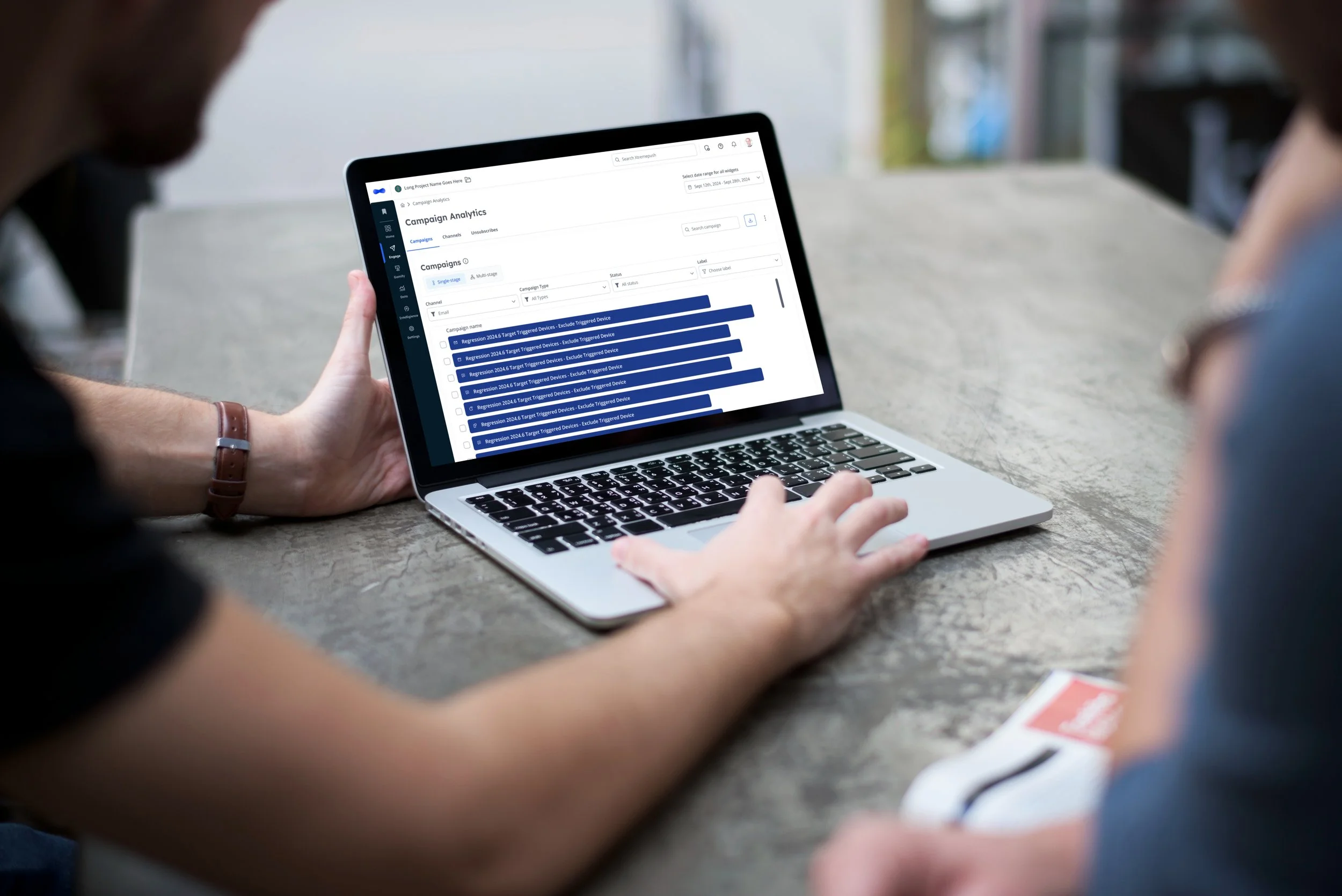
The content audit revealed that our Analytics section had low engagement and inconsistent design — some areas were still built in the older UI.

 We saw this as an opportunity to reimagine how users understand their data, ensuring analytics deliver clarity, value, and actionable insights directly within the platform.
Context
Discovery & Research
Discovery
Research
The content audit revealed that our Analytics section had low engagement and inconsistent design — some areas were still built in the older UI.
We saw this as an opportunity to reimagine how users understand their data, ensuring analytics deliver clarity, value, and actionable insights directly within the platform.
To validate assumptions and understand what data users actually value, I conducted a survey with over 70 respondents. This helped us capture both quantitative priorities and qualitative pain points.
Key insights from the survey:
Highest priority: Event tracking and user actions
Moderate: User demographics and funnel analysis
Lowest priority: Financial and device metrics
Users wanted clarity, speed, and visual hierarchy — not just more data
This revealed a misalignment between what users wanted and what the platform presented, shaping a data-driven foundation for the redesign.
Design
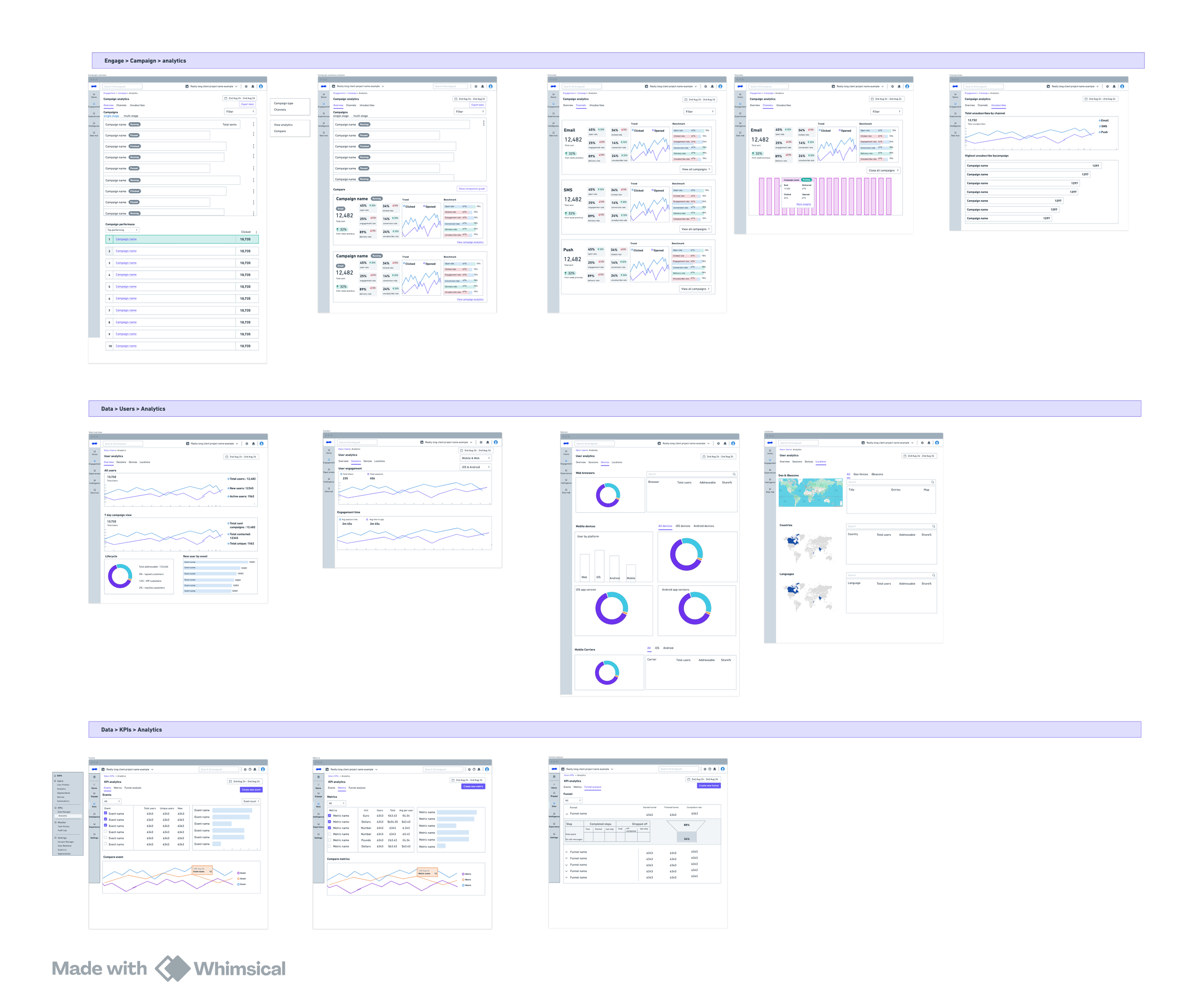
Wireframes
The wireframes went through multiple iterations focused on interaction design and visualising metrics in meaningful ways.
Collaboration was constant with:
The Lead Product Manager — to define metrics and their hierarchy
Developers — to ensure feasibility and data accuracy
Stakeholders — to confirm alignment with upcoming reporting priorities.
UI
During the UI phase, I ensured the visual design communicated data clarity, hierarchy, and ease of comparison. Frequent design–dev reviews allowed us to adapt components for both performance and scalability
Anticipated Impact
Increase engagement with analytics pages through clearer data presentation and interaction design.
Once launched, the the redesigned analytics experience is expected to:
Reduce reliance on external tools by improving in-platform reporting capabilities.
Support faster decision-making by surfacing key insights upfront.
Reinforce Xtremepush’s positioning as an intelligent, insight-led marketing platform.
Explore more redesign projects
Platform Redesign

Navigation Redesign