

Platform Experience Redesign
Xtremepush is a powerful omnichannel CRM platform that unifies real-time customer data with engagement tools to deliver smarter, more personalised customer journeys.
Content Audit
〰️
Information Architecture
〰️
Tree testing
〰️
User Interviews
〰️
Wireframing
〰️
Prototyping
〰️
UI Design
〰️
Design Systems
〰️
Content Audit 〰️ Information Architecture 〰️ Tree testing 〰️ User Interviews 〰️ Wireframing 〰️ Prototyping 〰️ UI Design 〰️ Design Systems 〰️
This project focused on evolving the platform’s structure and design system to enhance navigation, simplify complex workflows, and enable a consistent, scalable experience across a growing product ecosystem.
Team
ProductDevelopment
Defined design strategy and priorities in collaboration with Product Management.
Led discovery, user research, information architecture, and high-fidelity design.
Partnered closely with developers throughout implementation and QA.
Coordinated workflows and design ownership with an external agency.
Advocated for scalable design patterns, design system consistency, and component logic across modules.
My Role - Lead Product Designer
Objective
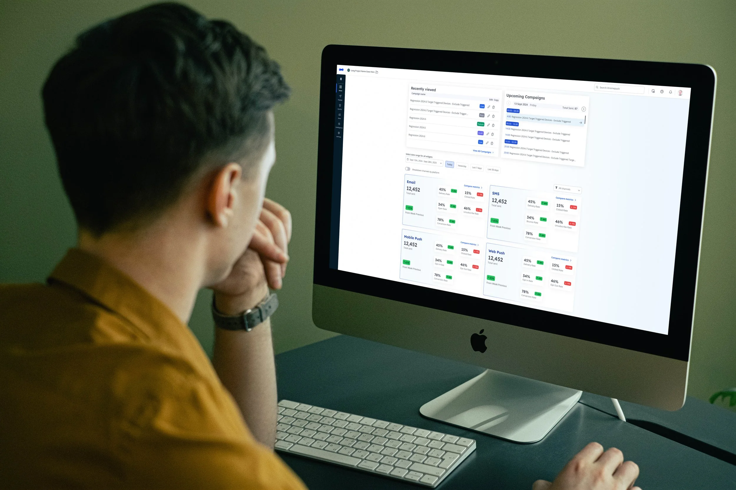
Following a brand refresh, the goal was to deliver a full overhaul of the platform’s user interface — improving usability, supporting a wider range of user types, and introducing new functionality for greater efficiency.
The redesign also aimed to reinforce Xtremepush’s positioning as an industry leader by modernising the product experience and staying ahead of competitors.
In parallel, the engineering team was upgrading the platform from Vue 2 to Vue 3, allowing for more scalable front-end development.
Discovery & Research
Establish a clear understanding of the current platform experience, identify structural inefficiencies, and define scalable foundations for future growth.
At the time, we were collaborating with an external agency. The audit and research phases helped us define ownership and ensure alignment between internal and external design teams.
Content Audit
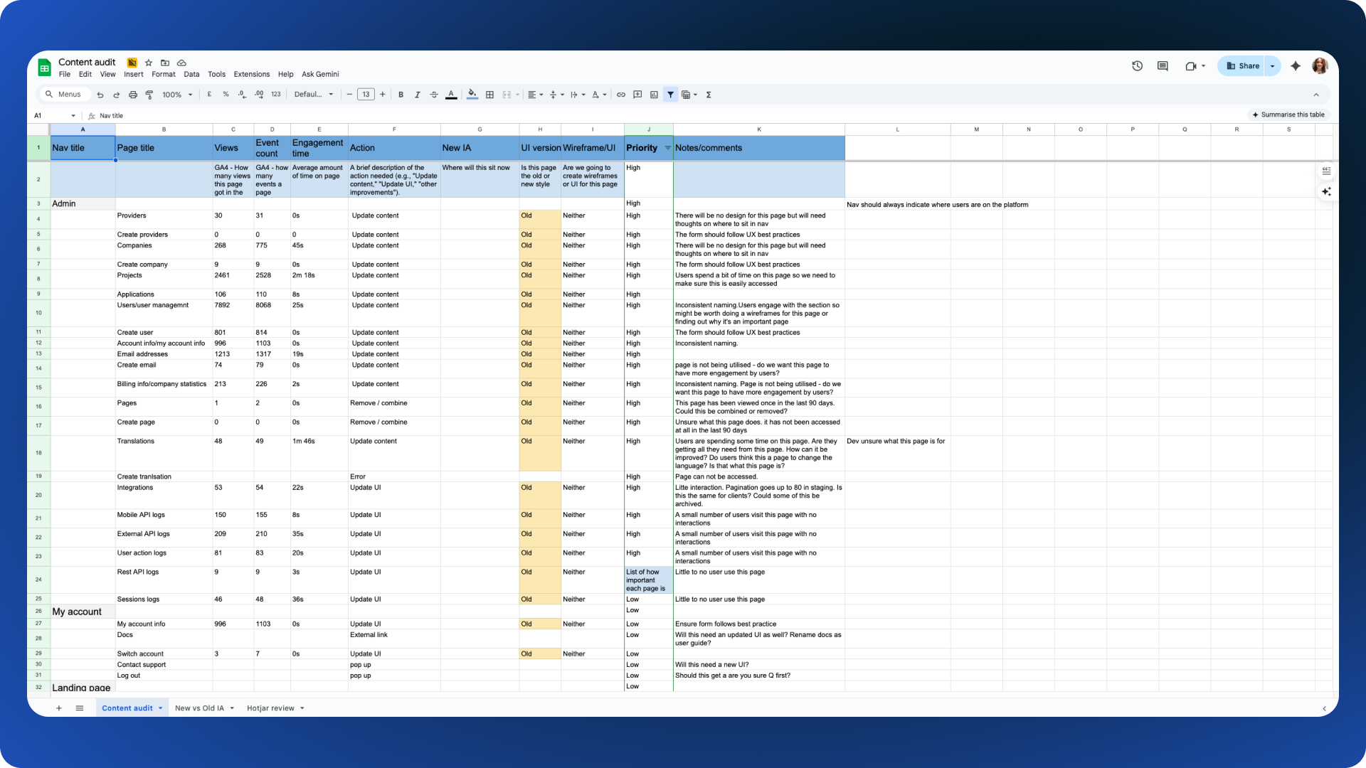
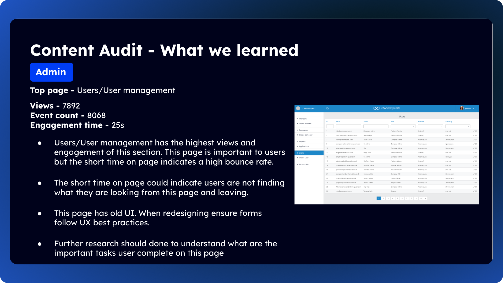
I conducted a full content audit of the platform to evaluate the accuracy, relevance, and performance of each page.
Each page was reviewed for
page views
event counts
engagement time
recommended actions (update, redesign, or wireframe only).
The goal was to identify underperforming areas, locate content gaps, and prioritise where UX and UI investment would have the most impact.
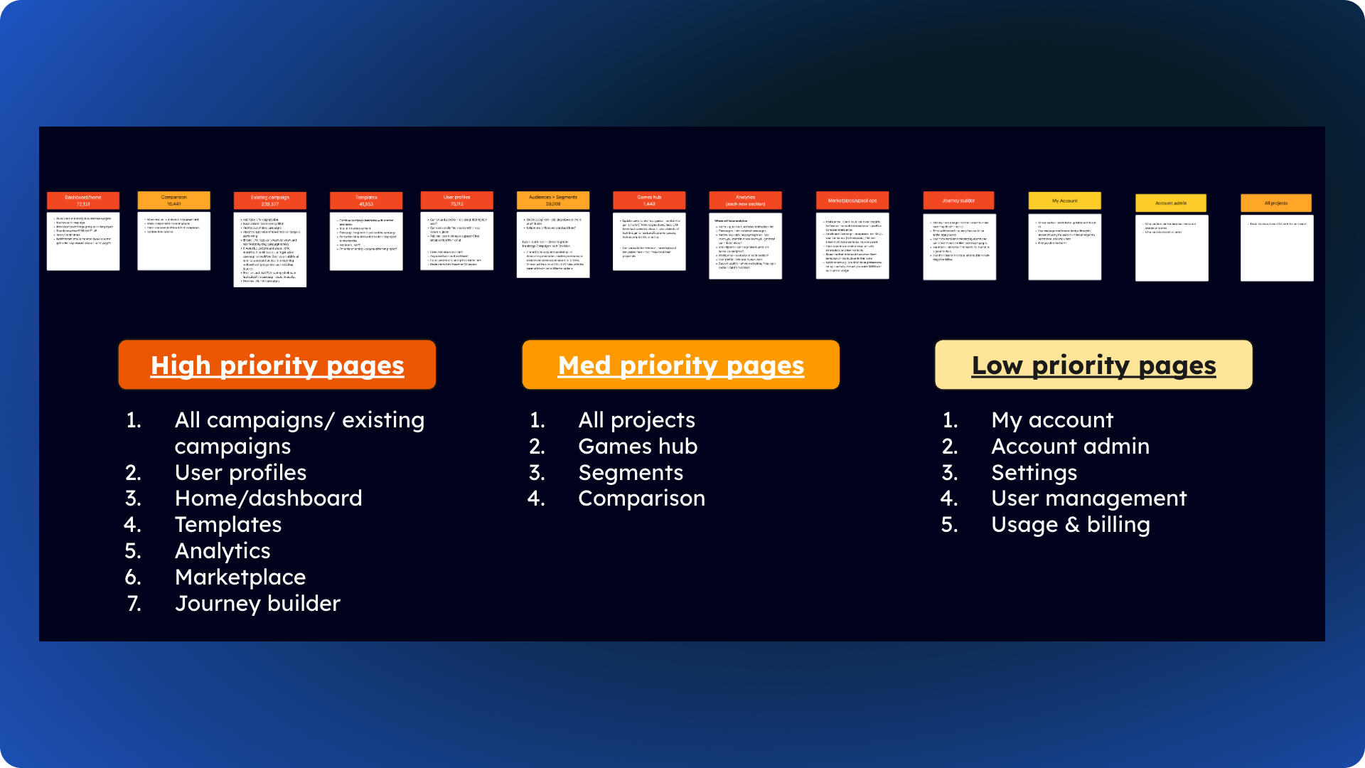
This process provided a holistic view of the platform and allowed us to categorise pages by priority:
High priority: Most engaged, requiring deeper research and UX/UI redesign
Medium priority: Moderate engagement, minor UX or content updates
Low priority: Minimal engagement, wireframe-only redesign
This prioritisation created structure and focus for subsequent design phases.


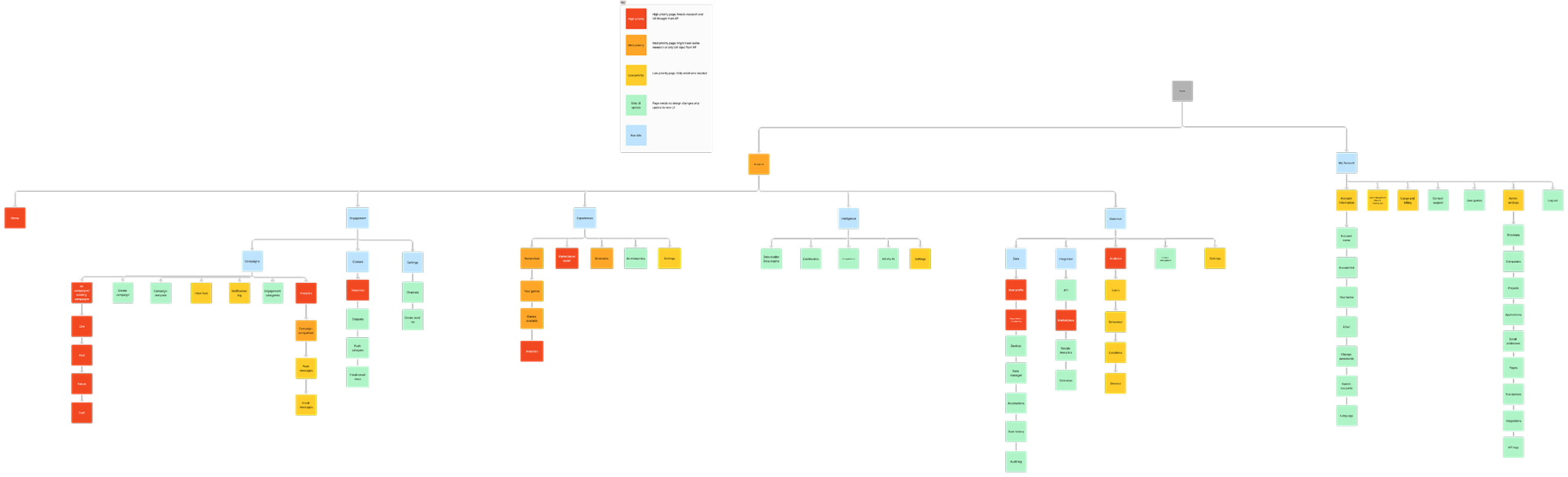
2. Information Architecture
The goal was to ensure that when clients purchased new packages or channels, the in-platform structure and terminology matched what they had seen during the sales process — improving navigation and onboarding.
As Product worked on the redesign, Marketing was developing a new product packaging model. I collaborated closely with the Head of Marketing to align platform navigation with these new packages.
To ensure taxonomy alignment, we maintained an open line of communication with Marketing and iterated on terminology as the packaging evolved.
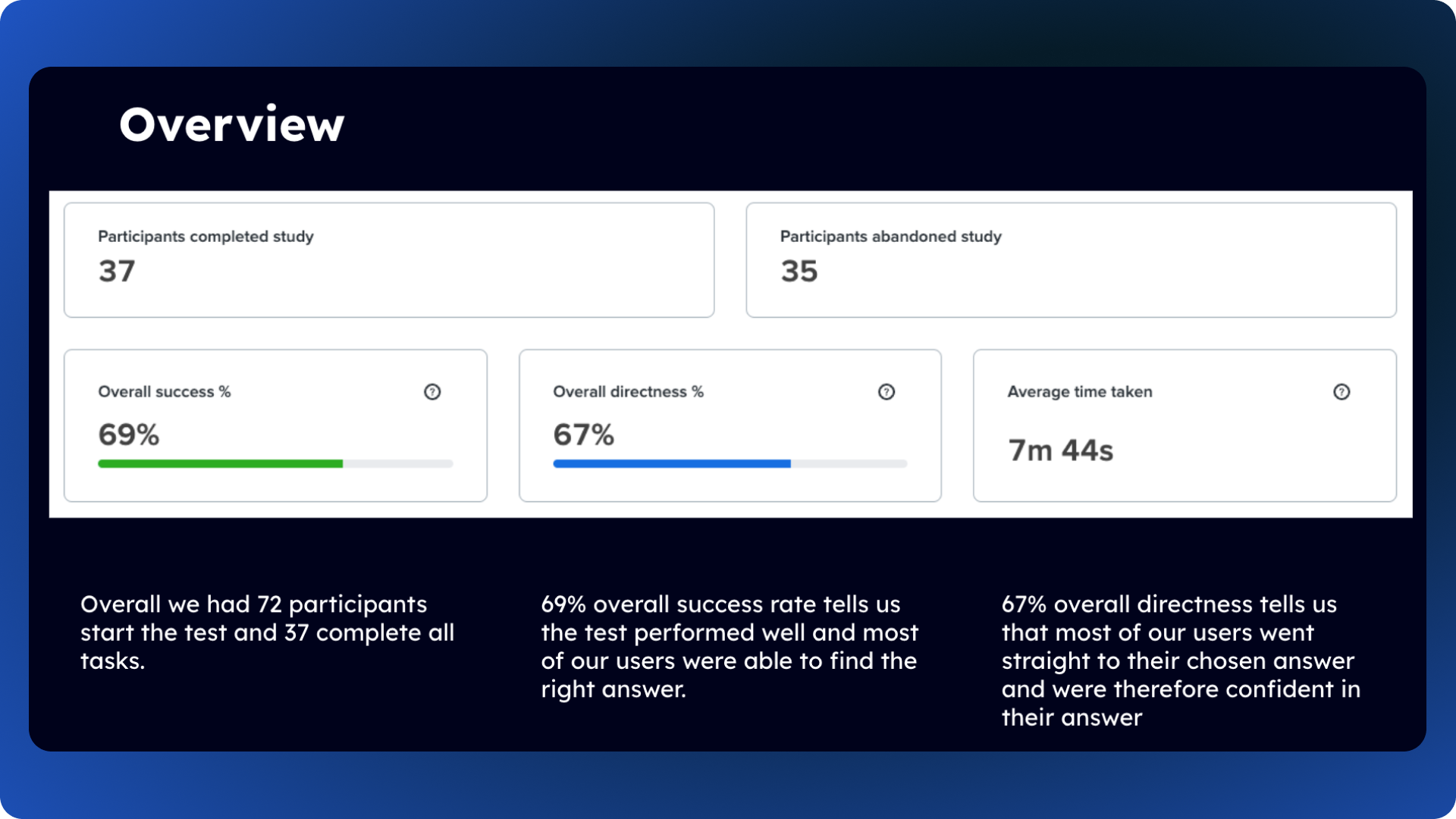
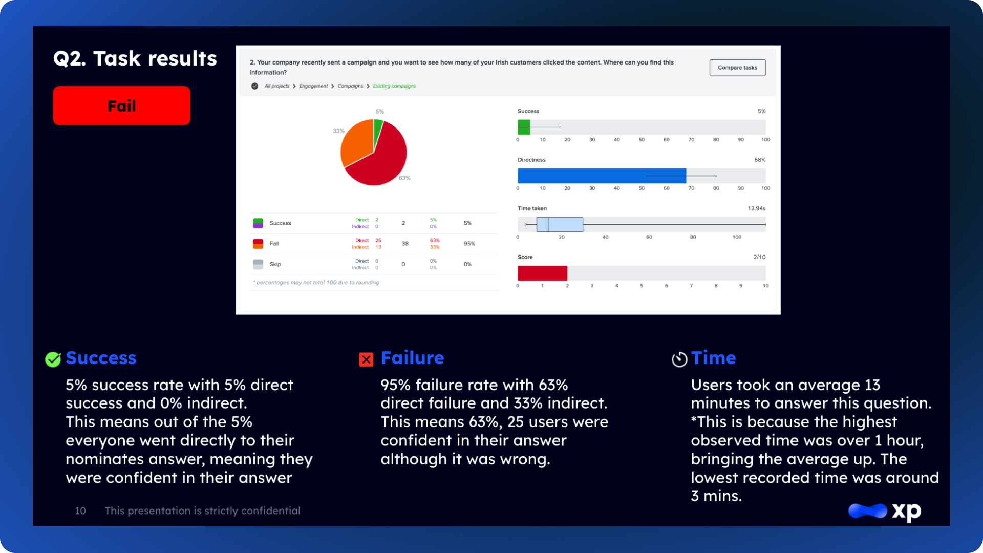
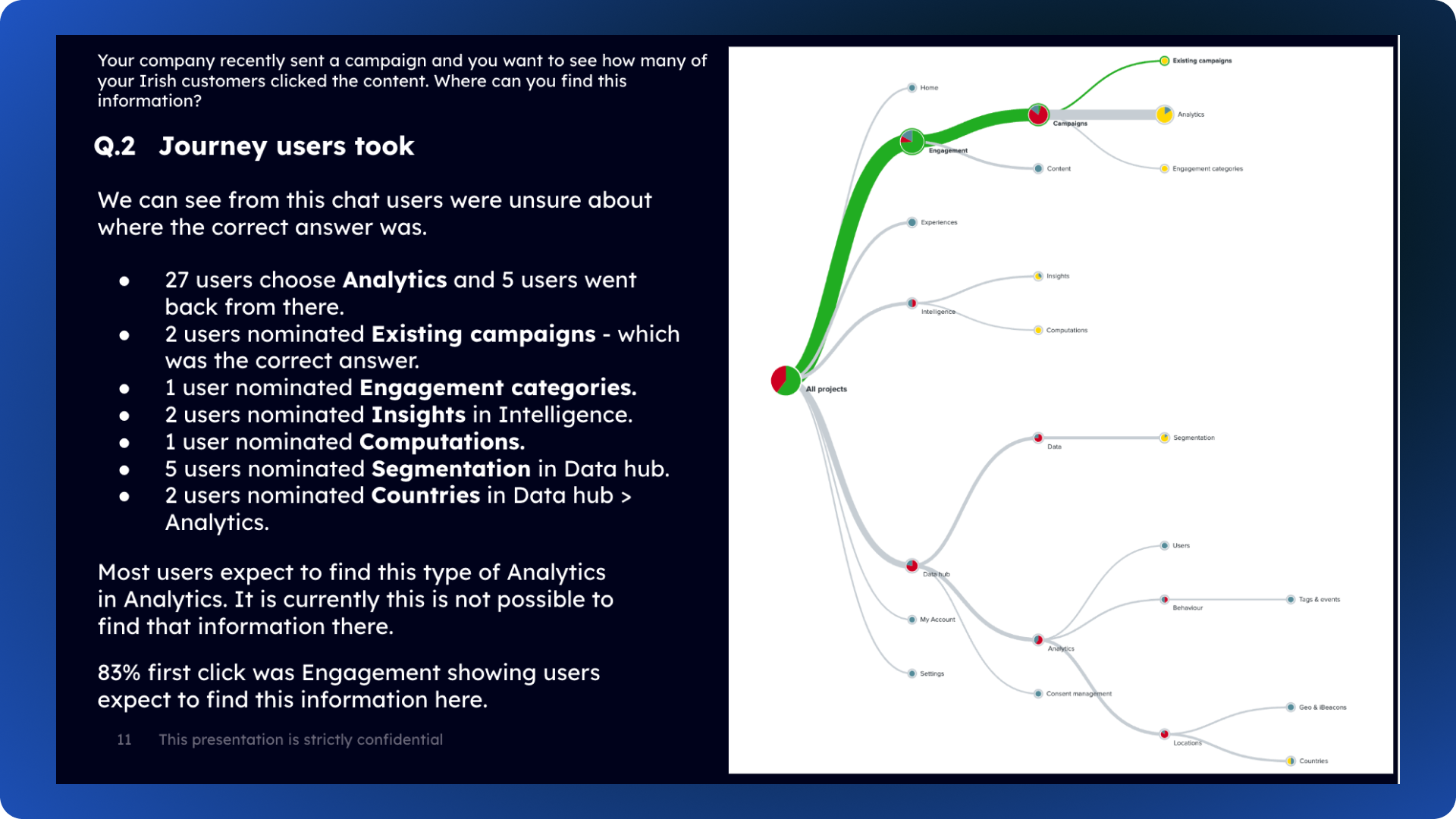
3. Tree test
72 participants started the test; 37 completed all tasks
Success rate: 69% → good overall performance
Directness: 67% → users were generally confident in their choices.
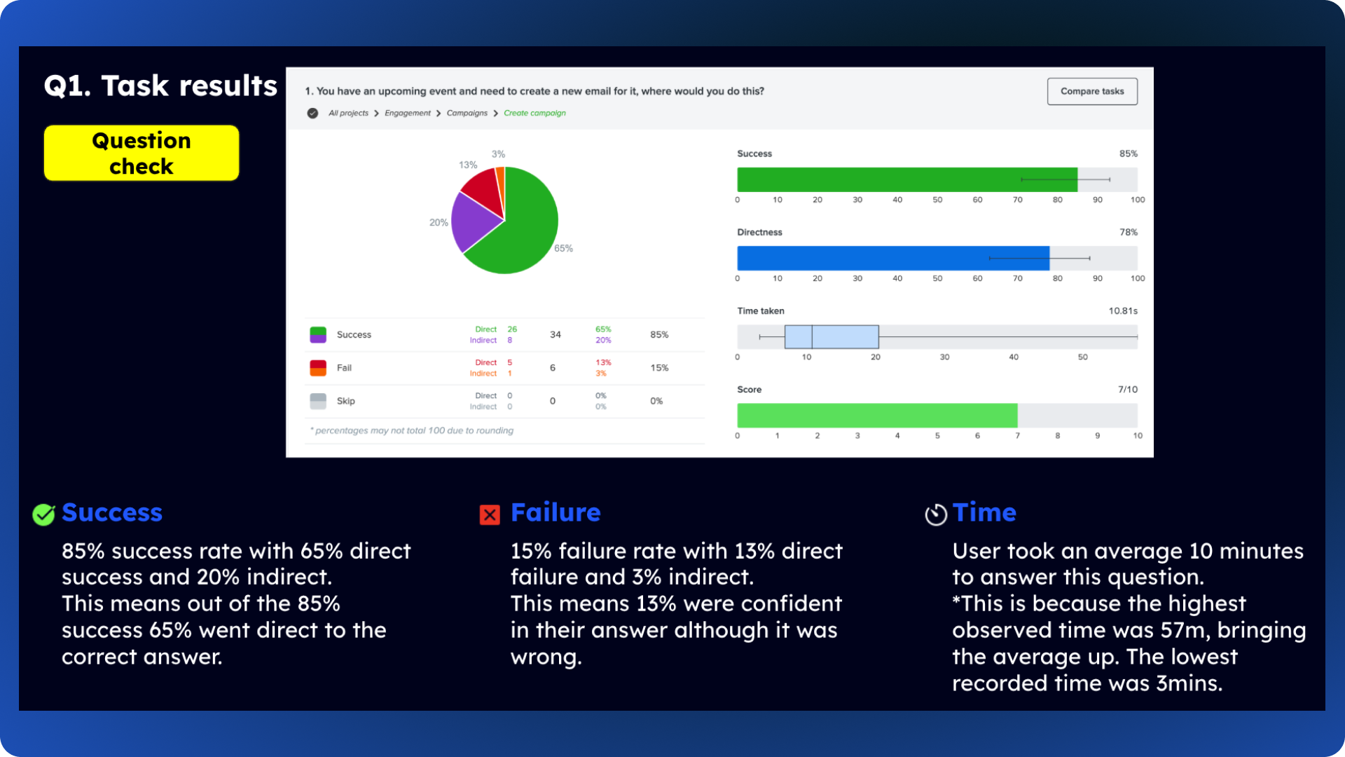
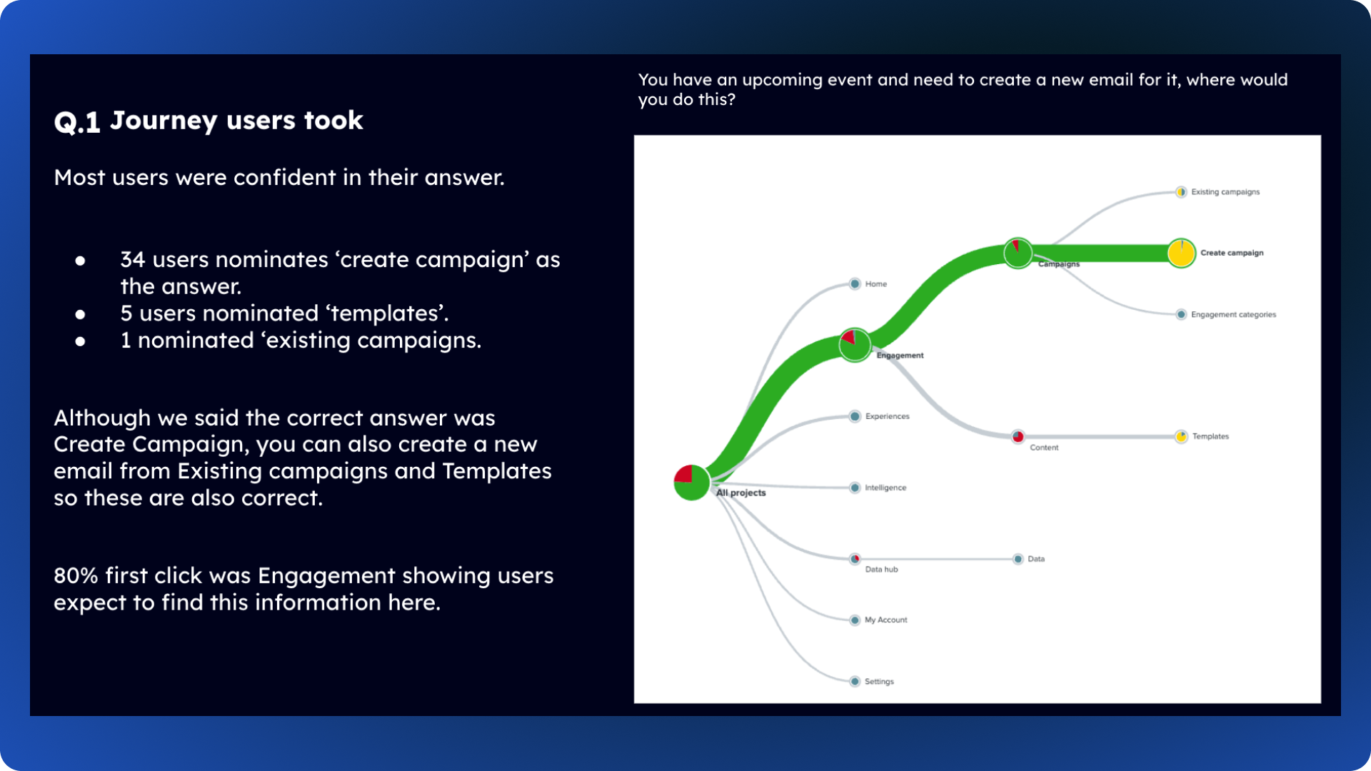
To validate our navigation model, I ran a tree test to measure findability and identify potential confusion before moving into design.
Key insights
High-performing areas: Tasks around campaign creation, product information, and user management achieved 80–90% success rates.
Pain points: Analytics-related tasks showed lower success; users often expected to find metrics under “Analytics” even when located elsewhere.
Terminology: Consistent naming conventions (e.g., “Profile,” “Infinity AI”) improved findability. Settings overlap: Users were unclear whether account management belonged under “Settings” or “My Account.”
Overview
These insights directly informed our focus on navigation clarity, improved grouping, and clearer labelling for analytics and admin areas.


Validation & Design
Translate research insights into a cohesive, scalable interface — validating key usability assumptions early to ensure the redesign improves clarity, navigation efficiency, and visual consistency across the platform.
Given the size of the project, the redesign was structured into multiple release packages.
Package 1 included:
Login · Navigation · Admin · My Account · All Projects · Homepage · Standard Dashboards · Rebranding.
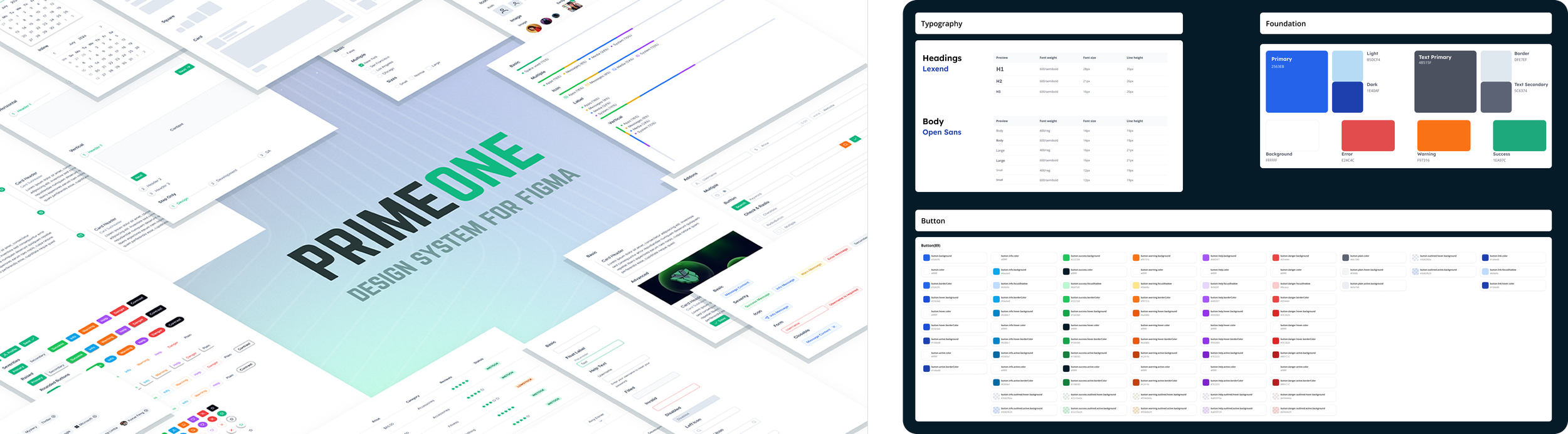
We established a new design system that reflected the updated brand — modern, sophisticated, and scalable.
While Marketing had defined brand colours and typography, these needed adjustment for accessibility and usability within the platform. Working closely with our in-house design team, I adapted the brand palette and components for a digital application.
In collaboration with development, we implemented a token-based system using PrimeVue, customising components and styles to reflect our updated platform identity
Design System Evolution
This approach allowed us to:
Maintain visual consistency across newly built and legacy components
Reduce design–dev handoff time by standardising interaction patterns
Create flexible themes that could adapt to future branding updates without full rework
We also introduced usage guidelines and component logic documentation, enabling designers and developers to work from a shared source of truth.
Explore more redesign projects
Navigation Redesign

Homepage Redesign
Analytics Redesign
Although the full redesign has not yet launched, this project has already aligned teams around a clear direction for the platform’s future.
The new design system and navigation structure have created a stronger foundation for scalability, improved consistency, and a more intuitive user experience.
Early usability feedback has been positive, and we anticipate reduced friction when navigating key areas like analytics and campaign management once released.
Outcome
This project reinforced the importance of grounding design decisions in evidence — from content audits and surveys to usability testing. Taking time to understand user behaviour and business goals upfront meant the design process was more focused and collaborative. Working closely with stakeholders and development teams ensured design intent was preserved throughout, while also building trust across departments.
Looking ahead, I’m excited to see how the redesign performs once live and to continue refining based on real-world insights.