Homepage Redesign
Redesign the homepage to create a meaningful, data-driven landing experience that gives users instant visibility into campaign performance and key actions — turning an underused page into a strategic dashboard for daily engagement.
Wireframing
〰️
Prototyping
〰️
UI Design
〰️
Design Systems
〰️
Wireframing 〰️ Prototyping 〰️ UI Design 〰️ Design Systems 〰️
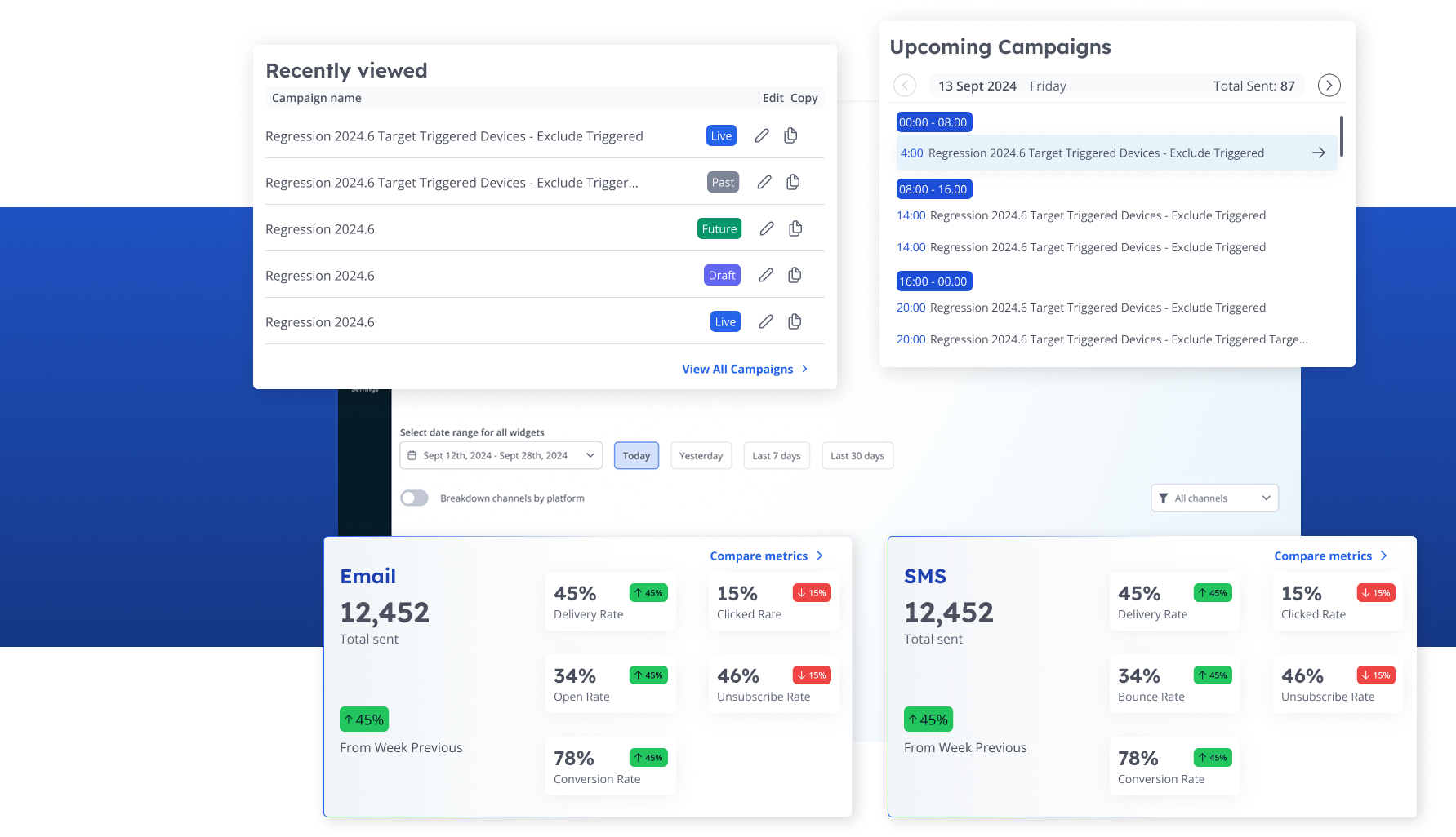
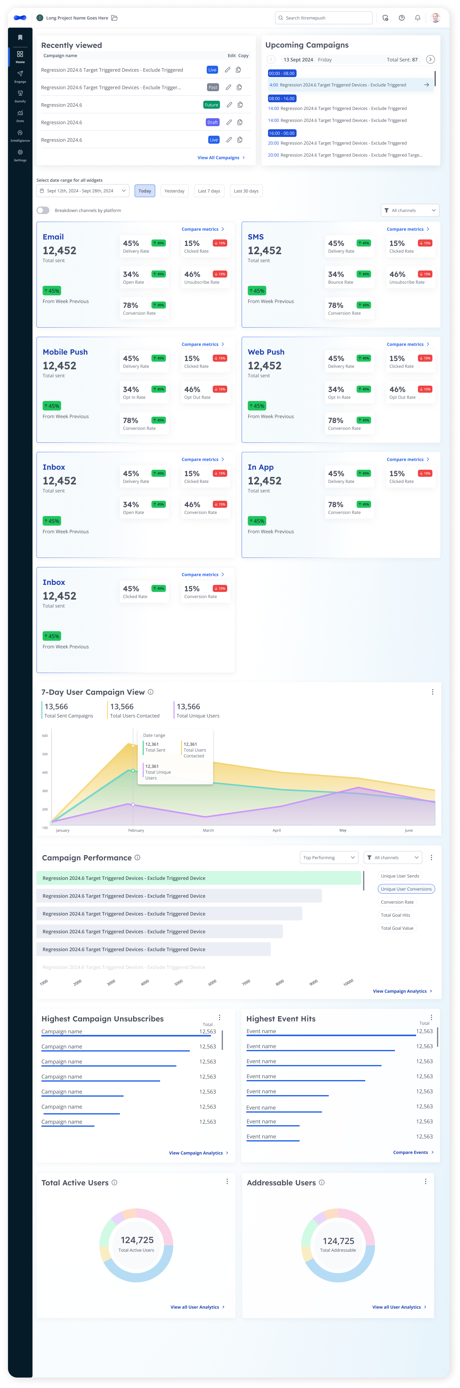
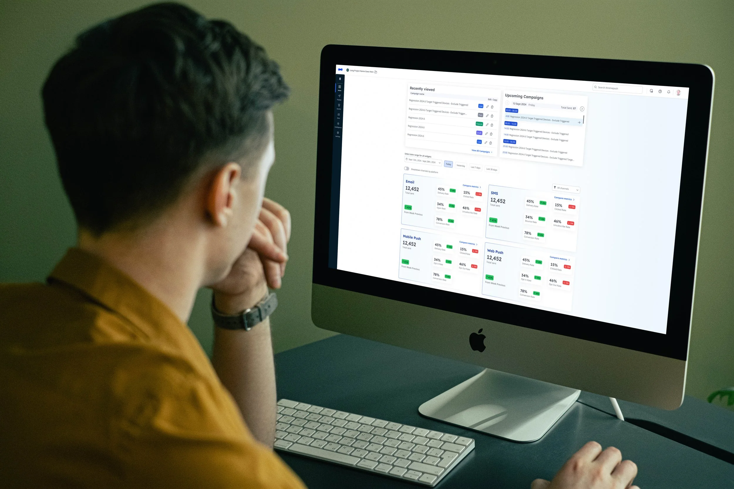
Design a homepage that provides users with a holistic overview of their campaigns, helping them understand performance and take action at a glance.
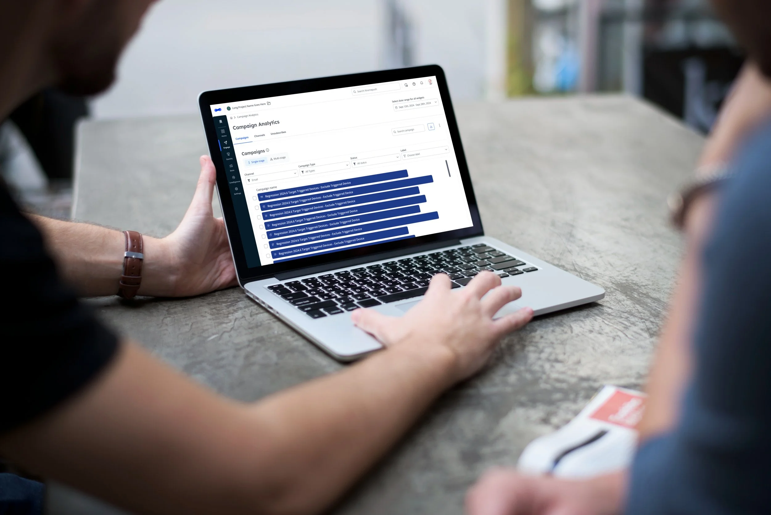
Following insights from the content audit, we found that users were spending very little time on the homepage — despite it being the first touchpoint after login.
This page represents prime real estate within the platform, and our goal was to ensure it delivered quick, actionable insights and served as a launchpad for key workflows.
Context
Our Process
Discovery
Building on insights from the platform-wide content audit and user research conducted during the main redesign, we identified that:
The homepage was one of the least visited areas in the platform.
Users rarely interacted with it, often bypassing it to reach campaign or analytics sections directly.
Given its position as the entry point to the platform, this represented a missed opportunity for immediate value delivery..
To address this, I collaborated with the Lead Product Manager to define what “value at a glance” should look like. We reviewed support tickets, Jira requests, and expert input from internal teams to shape the content strategy for this page.
Key user requests included:
Notifications or alerts for key campaign events
A campaign calendar view
A recent activity log
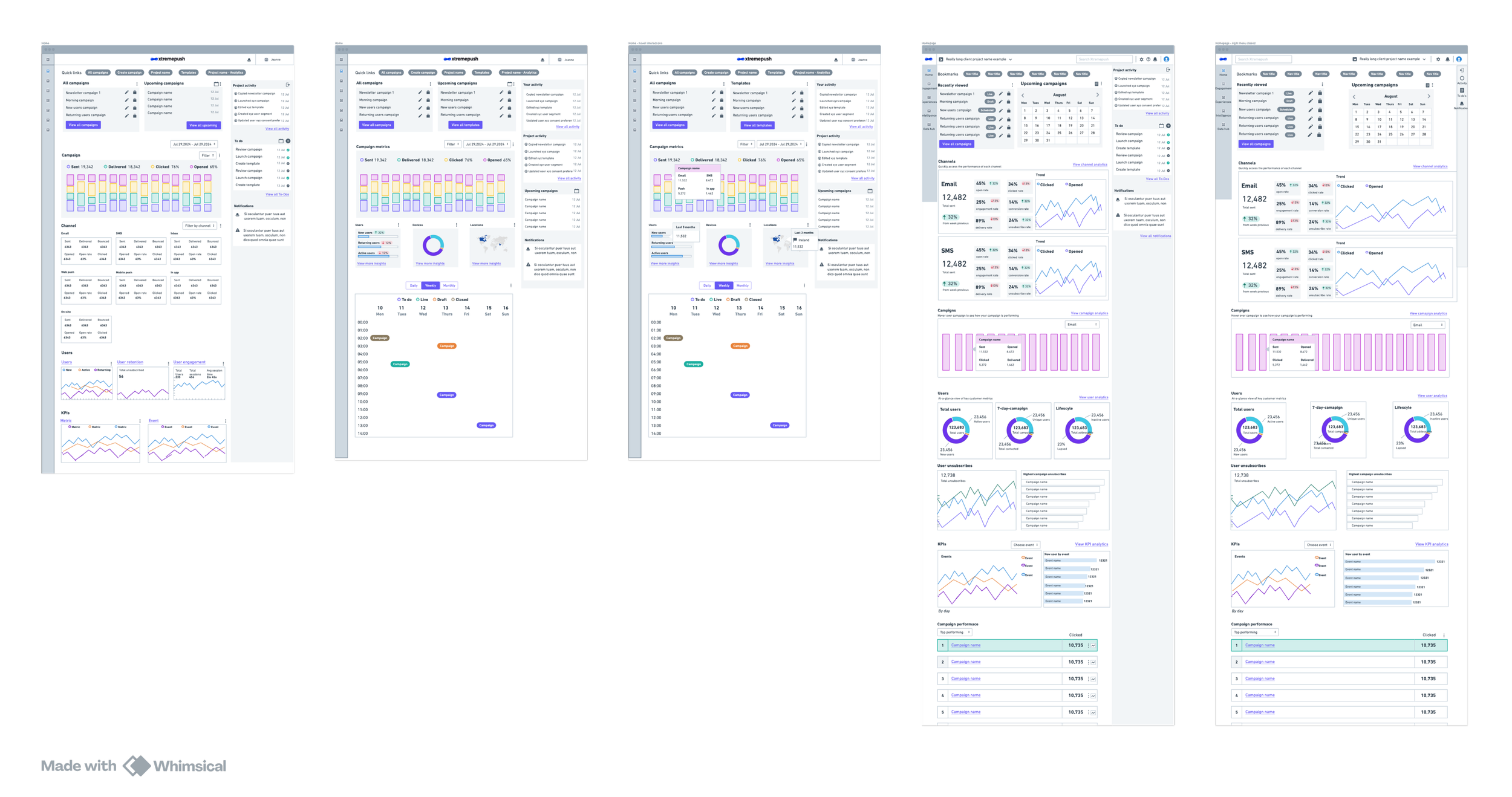
These insights informed initial wireframes that balanced information visibility with usability.
After exploring several wireframe concepts, we aligned on a design direction that prioritized quick insights and a clean layout. Due to time and resource constraints, we decided to phase complexity, focusing on foundational usability first — with advanced features (like campaign calendars and notifications) to follow in future iterations.
Wireframes
During the UI build phase, I held daily syncs with development to discuss implementation details and address trade-offs early. This ensured pixel-perfect execution, reduced rework, and maintained a consistent visual hierarchy across components.
UI
Anticipated Impact
Once launched, the redesigned navigation is expected to:
Increase user engagement by transforming an inactive page into an actionable command centre.
Improve visibility into campaign performance and status updates.
Provide a scalable foundation for future widgets (notifications, calendar view, activity feed).
Strengthen the perception of Xtremepush as a data-driven, user-first platform.
Explore more redesign projects
Platform Redesign
Navigation Redesign