Navigation Redesign
Redesign the navigation to create a modern, scalable structure that improves wayfinding, reduces friction in key workflows, and supports future platform growth.
Usability testing
〰️
Wireframing
〰️
Prototyping
〰️
UI Design
〰️
Design Systems
〰️
Usability testing 〰️ Wireframing 〰️ Prototyping 〰️ UI Design 〰️ Design Systems 〰️
Modernising the platform’s core navigation to improve discoverability, scalability, and alignment with future growth.
Context
At this stage, we were working with an external design team. My role was to oversee any work their product designer produced. Using all the discovery work completed earlier, we were excited to see how they would interpret our findings.
As the project evolved, it was decided that I would take full ownership of the UI design for the platform. This meant I could collaborate directly with key stakeholders to define the navigation’s structure and direction.
We explored examples from leading tech companies and agreed the navigation needed to feel modern, clearly structured, and flexible enough to scale as the platform grew.

Discovery & Research
Building on the discovery insights from the main platform redesign, we already had a deep understanding of:
User pain points across the platform’s existing information architecture
Content hierarchy and redundancies identified through the content audit
Common navigation frustrations from interviews, support tickets, and analytics reviews
Benchmark inspiration from modern SaaS platforms

Validate & Design
With clear direction and user needs defined, I moved into the UI design phase — focusing on navigation clarity, hierarchy, and responsive adaptability.
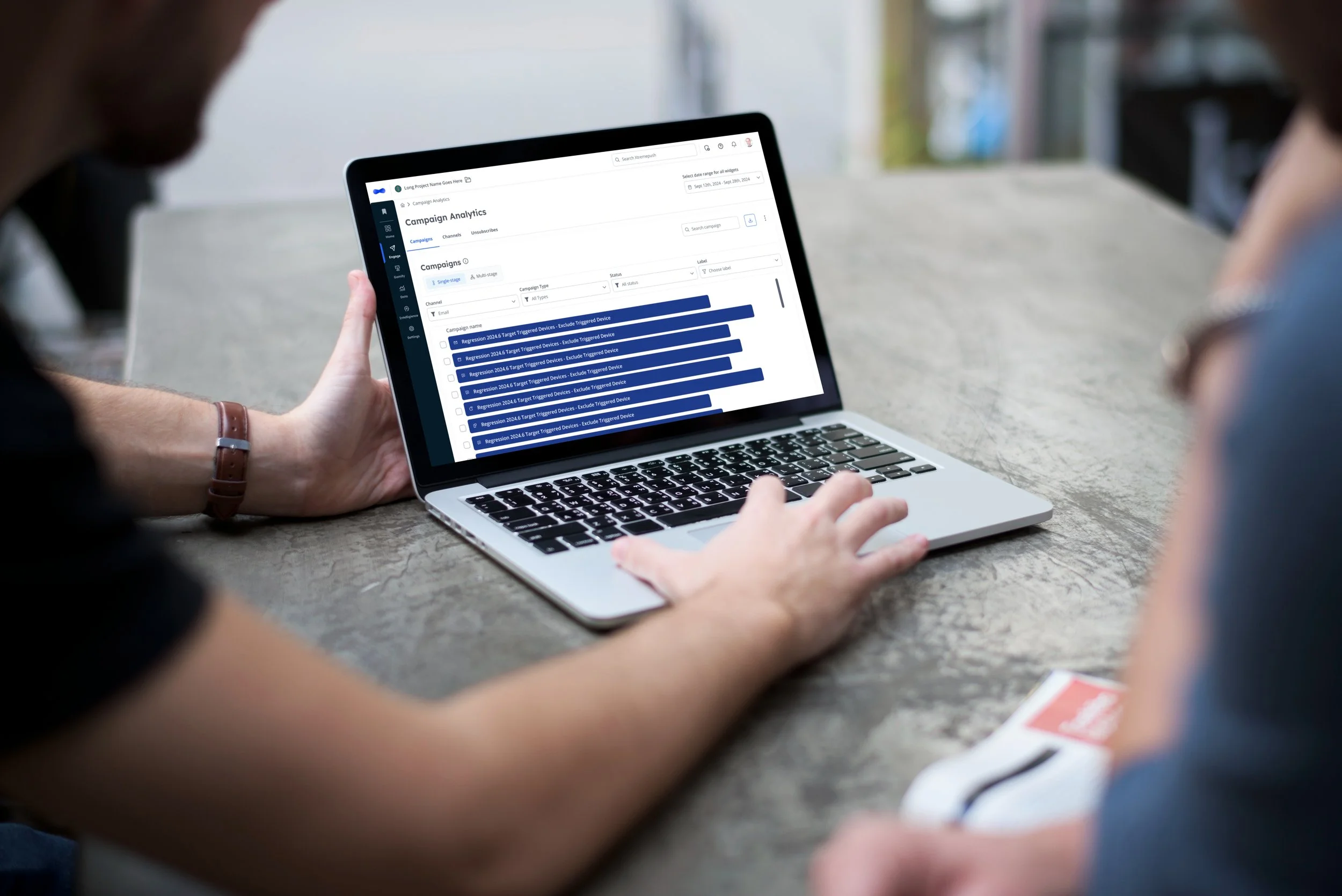
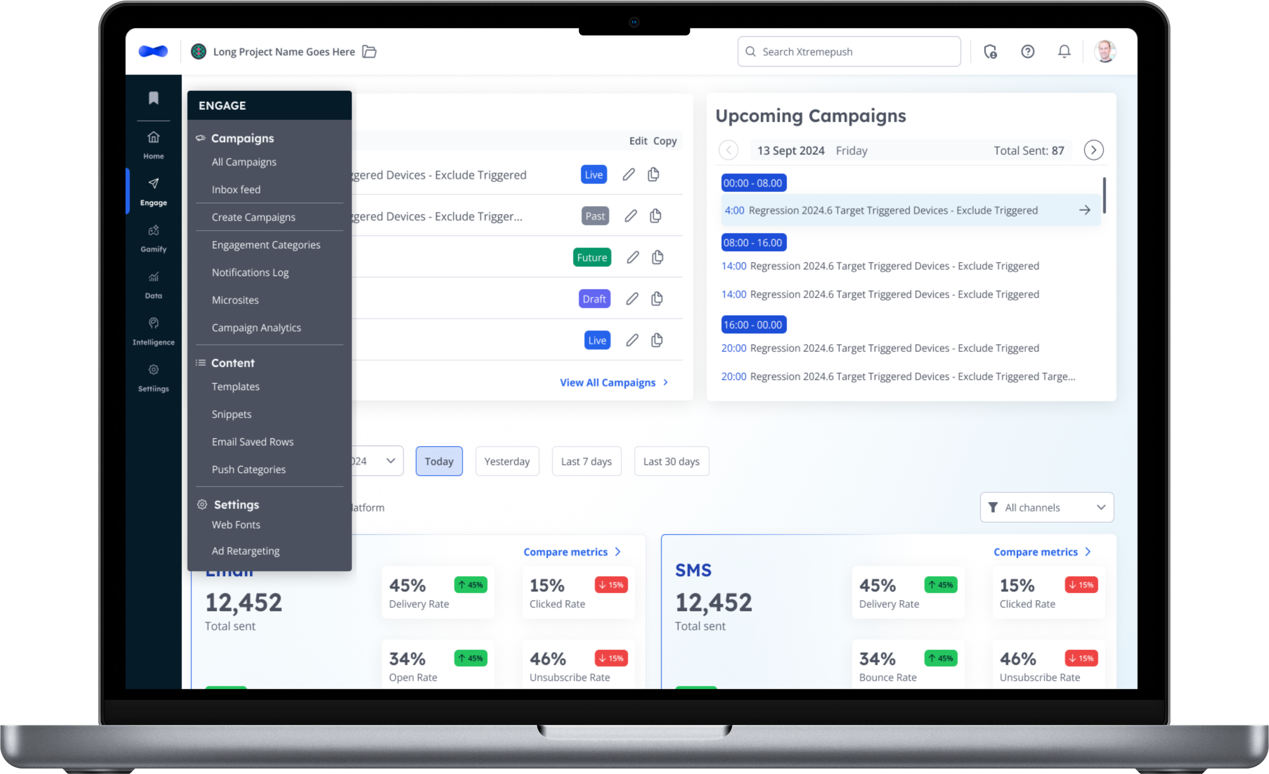
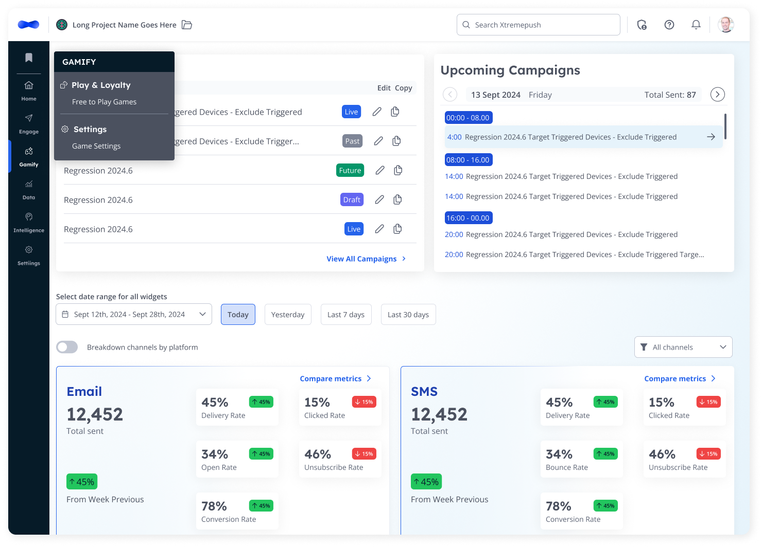
UI Design
Together with key stakeholders, we explored multiple layout patterns from leading SaaS and tech platforms to find the right balance between clarity, flexibility, and scalability.
The goal was to create a navigation system that felt modern and intuitive, yet capable of supporting the platform’s continued growth.
We analysed patterns from tools such as HubSpot, Braze, and Notion — platforms known for handling complex product ecosystems.
From this benchmarking, we identified a few key principles to guide the design:
Progressive disclosure: surfacing key actions upfront while keeping advanced options tucked away for power users.
Predictable hierarchy: maintaining consistent placement for navigation anchors to reinforce muscle memory.
Scalable architecture: designing a flexible side navigation that can easily expand as new modules and channels are added.
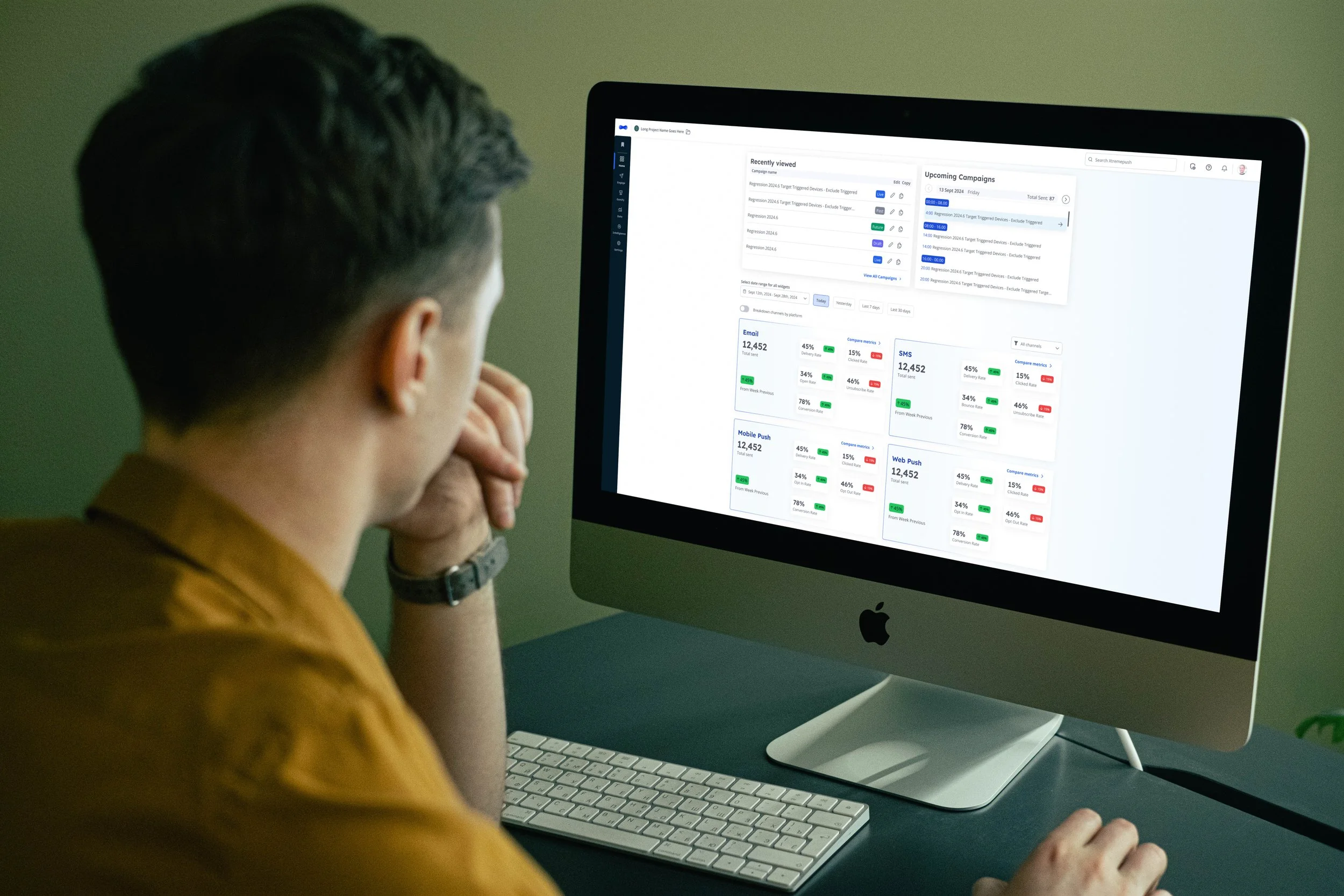
I developed high-fidelity prototypes that applied our updated design system, introducing a refined visual hierarchy, subtle motion cues, and clearer affordances for expanding or collapsing sections.


Usability tests
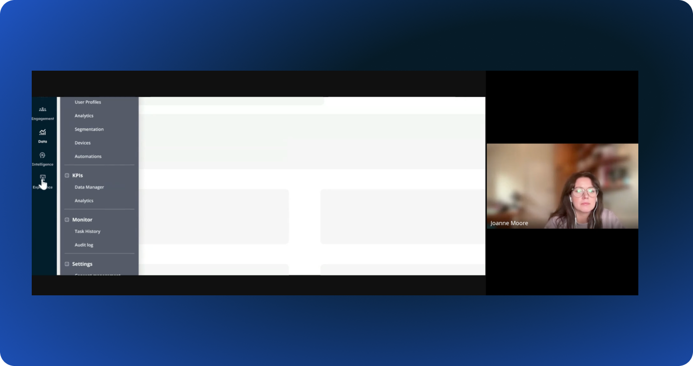
Once the navigation UI reached a stable prototype stage, I moved into validation to ensure our design decisions were working as intended.
The goal was to evaluate the clarity, intuitiveness, and overall efficiency of the new navigation system before development began — validating that users could easily find what they needed without friction or confusion.
Usability Testing Highlights
Success
All users found User Profiles and Automations quickly.
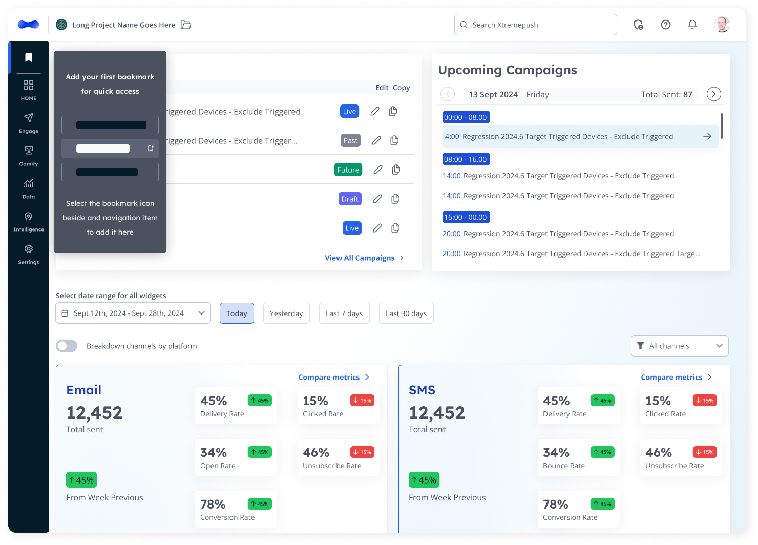
The nested expansion pattern (expand rather than shift) was described as clean, modern, and intuitive.
Pain Points
Some users initially struggled to locate Project Settings.
The “Engagement” label was confusing when managing campaigns.
Insight & Opportunities
Users frequently copy old campaigns — an opportunity to streamline templating.
Users requested bookmarks for quick access to key pages.


Anticipated Impact
Once launched, the redesigned navigation is expected to:
Improve task efficiency by minimising time to access key sections.
Establish a scalable foundation for new features and modules as the platform grows.
Reduce cognitive load by simplifying navigation and grouping related content intuitively.
Explore more redesign projects
Platform Redesign

Homepage Redesign