

Rebuilding an enterprise platform, one system at a time
A full UI and IA overhaul of a B2B engagement platform. Delivered in phases, grounded in research.
Role
Sole designer, leading the platform redesign · strategy to execution
Scope
Full platform · 4 workstreams · design system
Evidence
139-page audit · tree test (72) · usability testing · Hotjar
Status
Phased rollout: Navigation shipped, Homepage & Tables in build
The context
Xtremepush is an omnichannel engagement platform used by enterprise marketing teams to unify customer data and run cross-channel campaigns. After a brand refresh, the platform needed a full UI overhaul: the interface was dated, the information architecture had grown tangled as the product expanded, and the visual language no longer matched where the company was positioning itself.
The redesign ran alongside a parallel engineering effort to migrate the front end from Vue 2 to Vue 3 so every design decision had to work within a system being rebuilt underneath it. Given the scale, the work was structured into release packages rather than a single launch.
My role
Sole in-house designer, leading the platform redesign
Defined design strategy and priorities with Product Management
Led discovery, research, information architecture, and high-fidelity design
Took full ownership of platform UI when the work moved in-house from an external agency
Built and maintained the design system with development
Partnered with developers through implementation and QA
Shared Discovery
Everything below was built on one discovery phase, not four. Rather than research each area separately, the platform-wide discovery fed every chapter that followed.
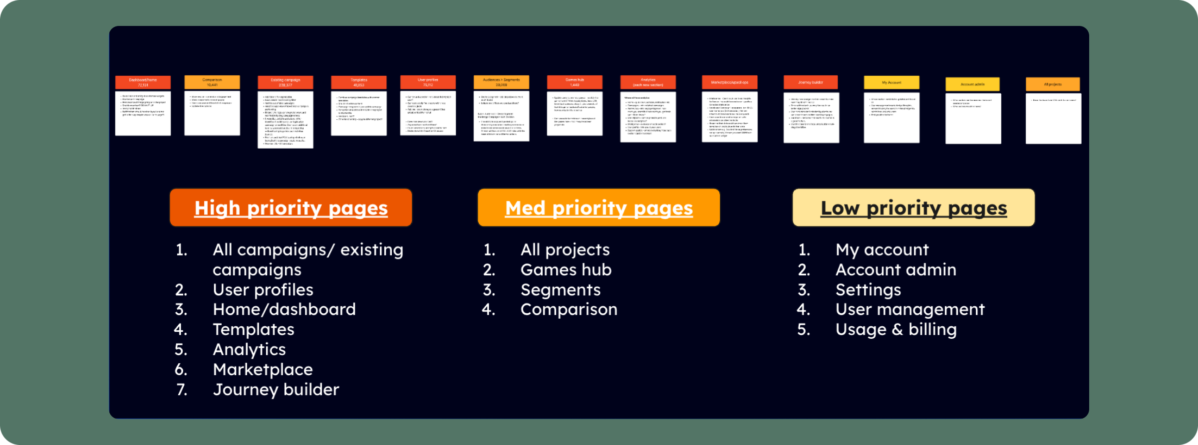
I audited all 139 pages of the platform, scoring each on page views, event counts, and engagement time, then assigning an action: redesign, update, or wireframe-only. This produced a priority map — high-engagement areas got deep UX work; low-engagement areas got lighter treatment — so effort went where it mattered.
Content audit
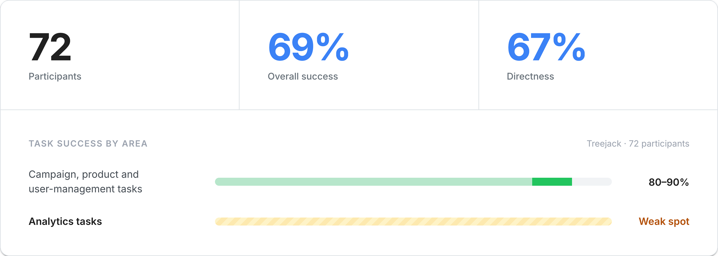
Before committing to the new structure, I ran a tree test to measure findability. 72 participants; 69% overall success; 67% directness. Campaign, product and user-management tasks scored 80–90%. The notable weak spot was analytics — and the reason was a deliberate structural change (covered in the Navigation chapter): I'd moved analytics out of its single top-level section and distributed it into the areas it related to. Existing users, used to one "Analytics" home, still looked for it in one place. The tree test surfaced that friction early, so it could be validated before build.
Tree test
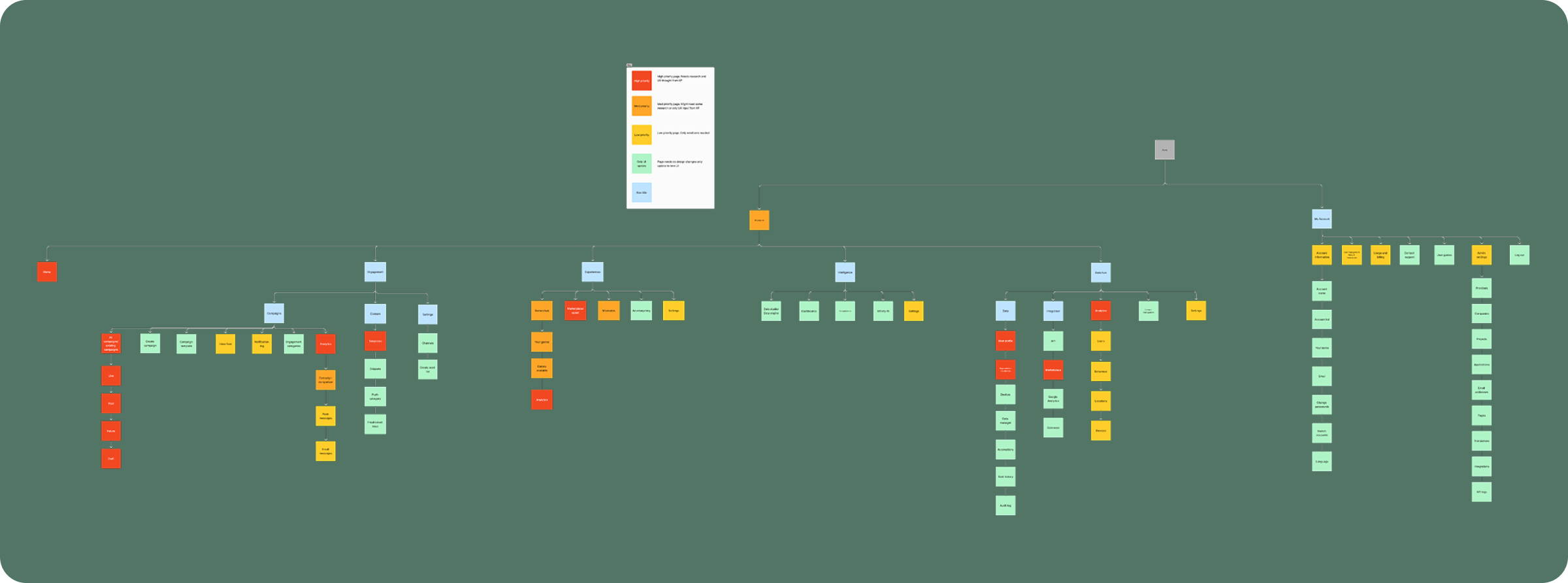
As Product redesigned, Marketing was building a new product-packaging model. I worked with the Head of Marketing to align in-platform navigation and terminology with the packages clients saw during the sales process — so what they bought matched what they found once inside.
Information architecture
The design system
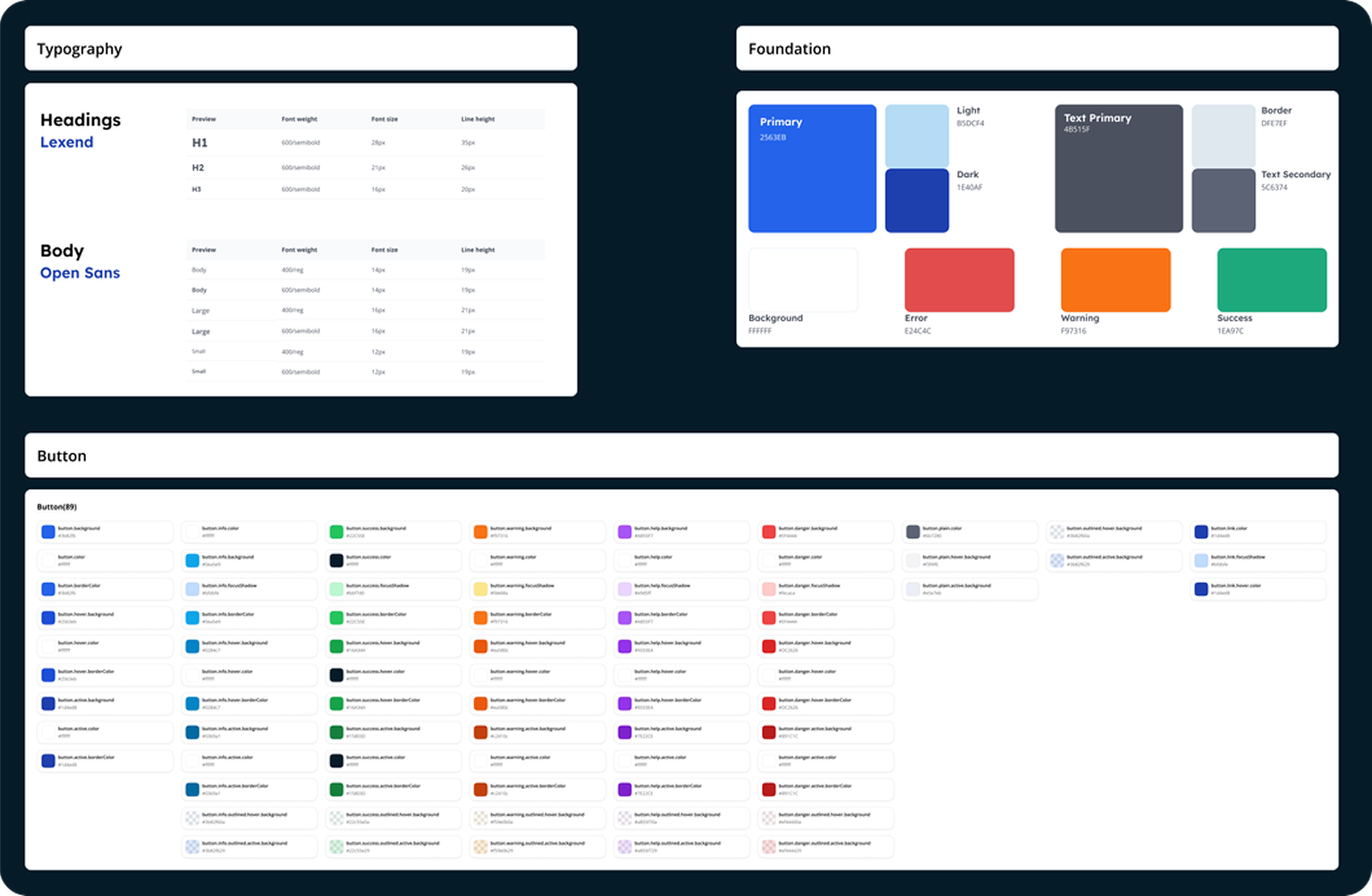
A platform redesign is only as consistent as the system underneath it. Before building screens, I established a design system that every chapter would draw from.
Marketing had defined brand colours and typography, but they needed adapting for accessibility and usability in a dense, data-heavy application — brand colours that work on a billboard don't always pass contrast on a dashboard. Working with development, I built a token-based system on PrimeVue, customising components and styles to the platform's identity.
Keep visual consistency across newly built and legacy components during a phased rollout
Cut design-to-dev handoff time by standardising interaction patterns
Theme flexibly, so future brand updates wouldn't need a full rework
The system let us:
I also wrote usage guidelines and component-logic documentation, giving designers and developers a shared source of truth rather than one-off decisions per screen.
Three chapters on one foundation
With the research and system in place, the redesign rolled out across the platform. Three chapters show the range.
Jump to
Navigation
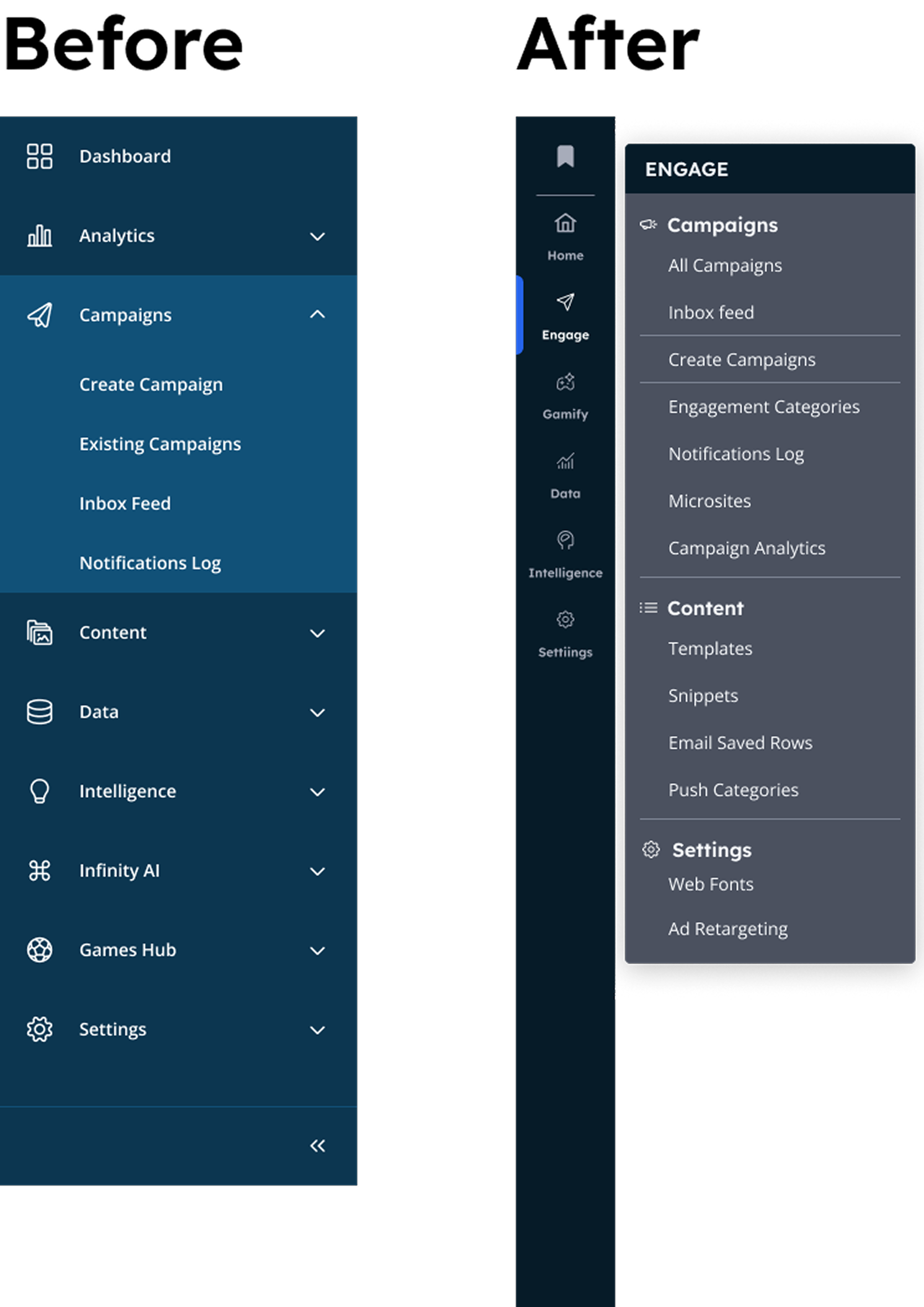
The problem. The old navigation had grown inconsistent as the product expanded. It was hard to scan, hard to scale, and misaligned with the new IA.
My role. This is where UI ownership moved in-house to me. Using the discovery work, I collaborated directly with stakeholders to define the structure and direction.
Progressive disclosure: key actions upfront, advanced options tucked away for power users
Predictable hierarchy: consistent placement so navigation becomes muscle memory
Scalable architecture: a side nav that expands cleanly as modules and channels are added
The decisions. I benchmarked how mature SaaS platforms handle complex ecosystems like HubSpot, Braze and Notion and set three principles:
The signature interaction: nested sections expand in place rather than shifting the whole layout and were described in testing as clean, modern and intuitive.
Jump to
Homepage
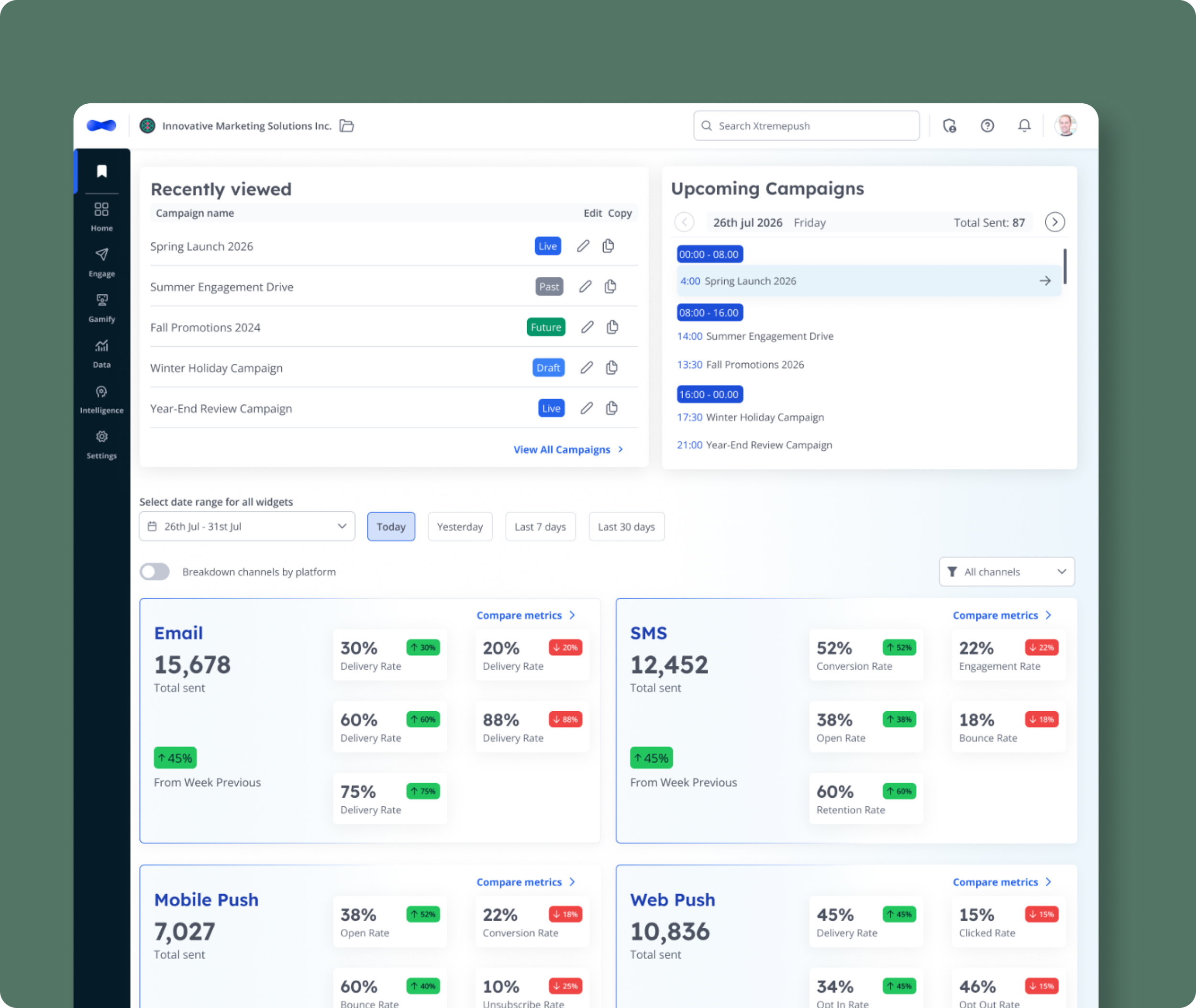
The problem. The content audit surfaced a contradiction: the homepage was one of the least-visited pages in the platform despite being the first screen after login. Prime real estate, wasted. Users bypassed it straight to campaigns or analytics.
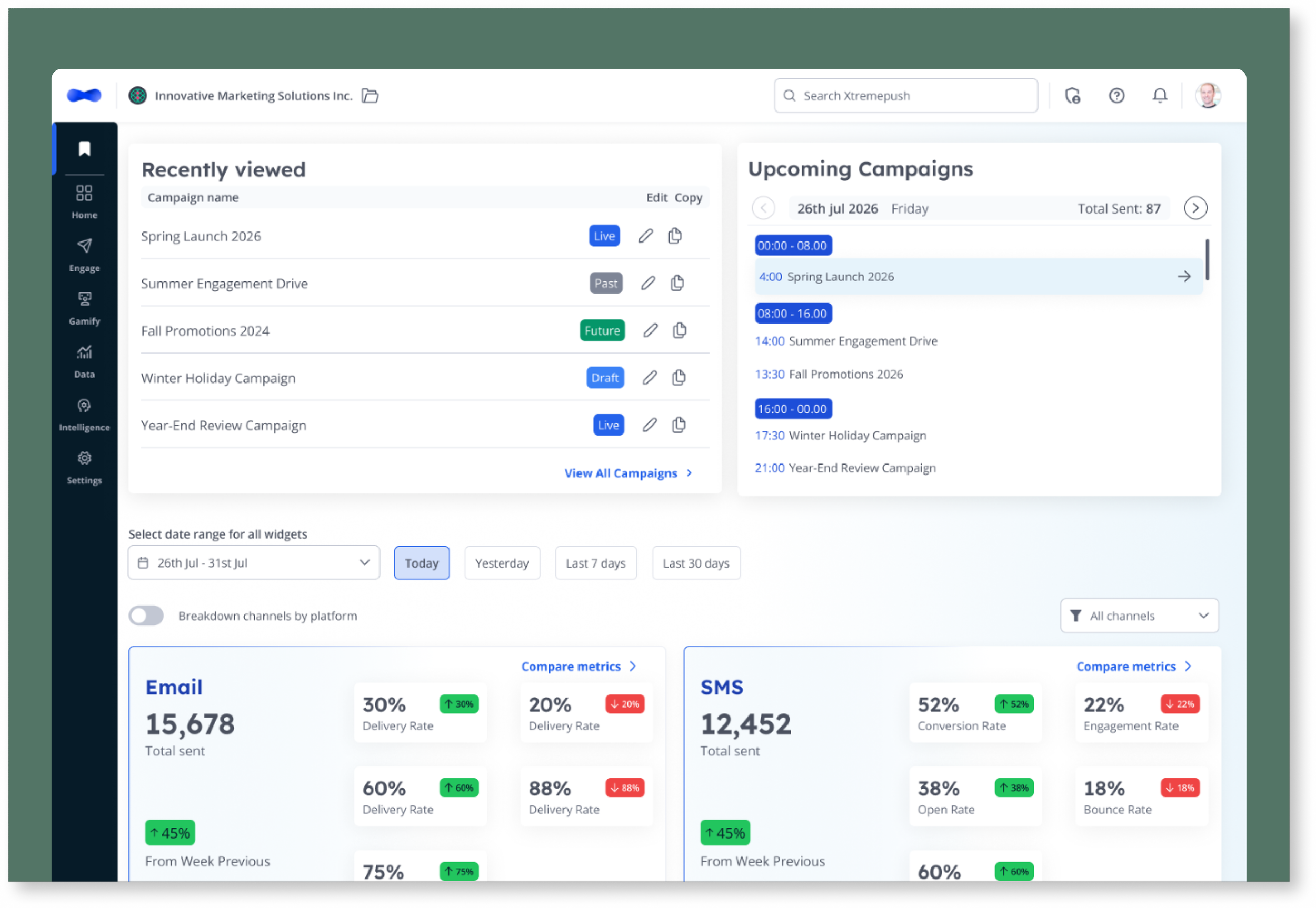
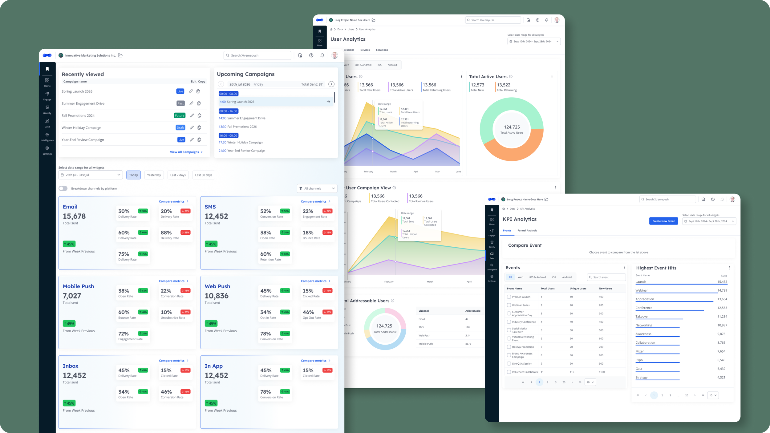
The approach. With the Lead Product Manager, I defined what "value at a glance" should mean. We reviewed support tickets, Jira requests and internal expert input to shape the content, turning an empty landing page into a data-driven command centre rather than guessing at widgets.
The decisions. I prioritised for impact and phased the complexity, having foundational, high-value widgets first; calendar and notifications deferred to later iterations. Shipped widgets:
Recently Viewed: jump back into recent campaigns
Upcoming Campaigns: daily and monthly view of what's scheduled
Action Alert: a collapsible "action required" banner in the new branding
Top user requests: alerts for key campaign events, a campaign calendar, and a recent-activity view.
Jump to
Tables & Labels
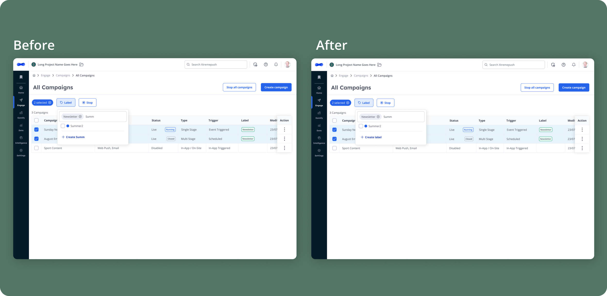
The problem. The platform is full of dense tables in campaigns, templates, audiences, devices, automations and more. As accounts grew, these became hard to scan and manage. This chapter reworked table views across 12+ page types to improve list visibility and control.
The decisions. A connected set of improvements for working with heavy data:
Multi-search and improved filtering: find rows in large tables faster
Labels: organise campaigns, templates, audiences and snippets with custom, colour-coded labels; filter by them with AND/OR logic
Bulk actions: act on many rows at once (this came directly from a Hotjar session review showing users repeatedly copying multiple campaigns one by one. A manual pattern the design removed)
Folders and saved views: persistent organisation for recurring work
Turning it into evidence
When the label flow went to QA, they pushed back: it wasn't intuitive.
The create option only appeared when no matching label existed (so an existing "Label1" blocked creating "Label"), assignment-by-checkbox wasn't obvious, and there was no character limit so long names overflowed.
Rather than argue design principles — my pattern vs their opinion — I ran a usability test and let user behaviour settle it. Five moderated sessions on a Figma prototype, mixing platform-familiar and non-platform participants.

The evidence sorted the concerns better than any debate could have:
The core interaction held. All 5 found the pattern unprompted. It stayed.
QA's concerns were real. Create was a blocker (4 of 5) → fixed with an explicit entry, the bug, a character limit, and 3-dot labelling.
QA caught a deferred gap. Management/delete moved from v2 to v1; testing showed it was hard to reach (1 of 3) → added a signpost.
The final design was shaped by how users actually behaved, not by whose assumption won — the same principle that ran through the whole redesign.
Outcome
This was a platform-scale redesign delivered in phases, grounded in evidence at every step.
Navigation has shipped and passed QA - the new IA and nav pattern are live in staging ahead of rollout.
Homepage and Tables/Labels are built and in active development, with the label improvements refined through usability testing before release.
The design system is in place - a token-based foundation that kept a phased, multi-workstream redesign consistent and cut handoff time.
Research repeatedly changed the design: the tree test reshaped the IA, the content audit redefined the homepage, a Hotjar review created bulk actions, and usability testing rebuilt the label flow.
REFLECTION
The thread running through this project wasn't a single design; it was a way of working. When the analytics section was slated for removal (the subject of a separate case study) when QA and I disagreed on the label flow, when the homepage sat unused, the answer each time was the same: get evidence, don't defend assumptions.
A platform redesign is really a series of decisions about what to trust. I learned to trust the research over the loudest opinion in the room, including my own.