
Design system: creating a scalable design system across four codebases
ROLE
Product Designer, sole designer across CRM, Gamify, Loyalty, CDP and Platform
TIMELINE
Shipped - Nov 2026
TEAM
Head of Product, PMs and front-end engineers
SCOPE
Colour system, typography, PrimeVue components, navigation, modals, tables and breadcrumb patterns
I was the only product designer at Xtremepush, a B2B customer engagement platform, while it moved from a legacy UI to a new PrimeVue-based UI. I inherited a purchased component library and a marketing palette that didn't work on screen. My challenge was to make four different product surfaces feel like one product, without relying on one designer to review every screen.
Customers moved between CRM, Gamify and Loyalty, but familiar interface patterns changed between areas. My goal was to make the experience more consistent for customers and give engineering a system they could use without relying on me to review every screen.
IMPACT
30+
developers using the system as their reference
91%
60%+
of new features using the design system
of new features using reusable components
Designing the foundations
01.
The company had purchased PrimeVue to speed up development of the new UI. Rather than rebuild the library, I chose to adapt its existing structure and establish shared rules that engineering could use across the platform.
I focused on three foundations:
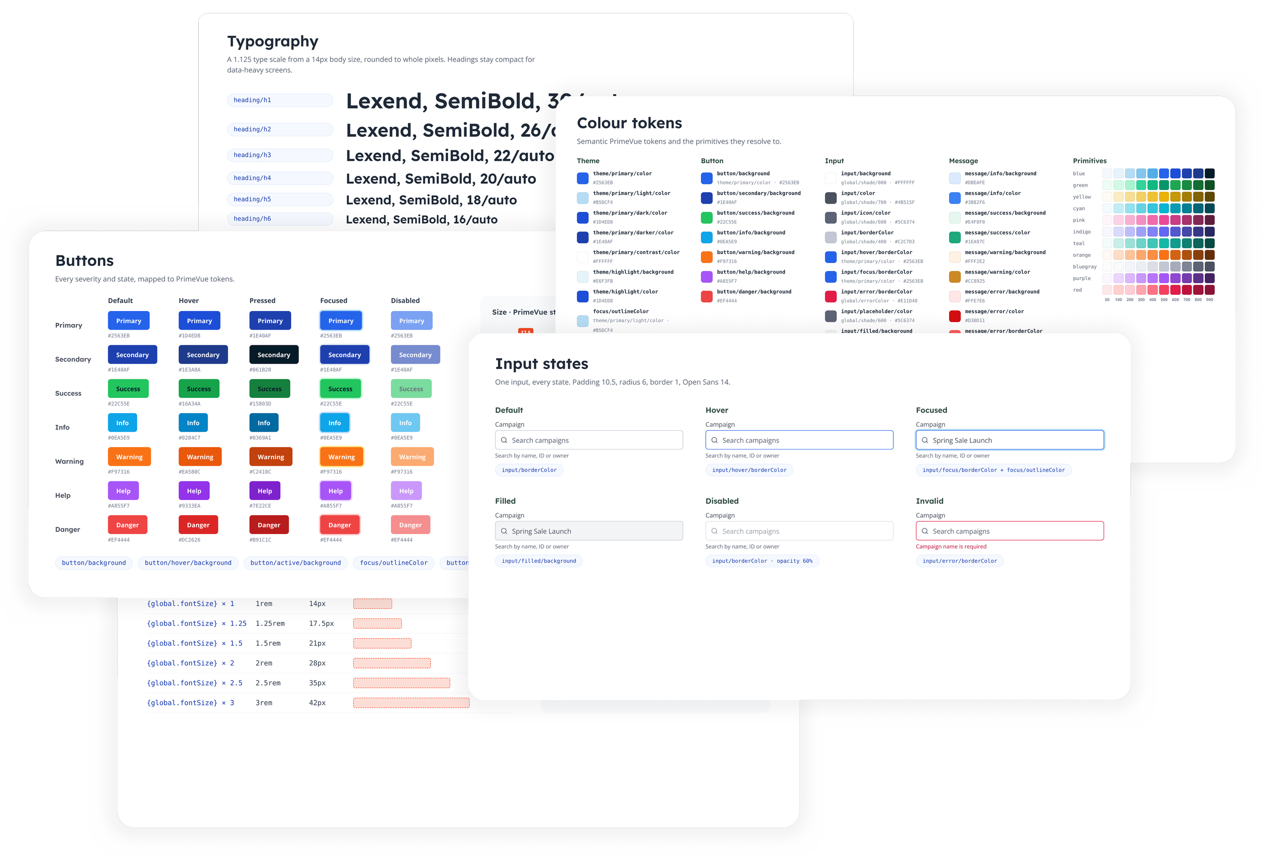
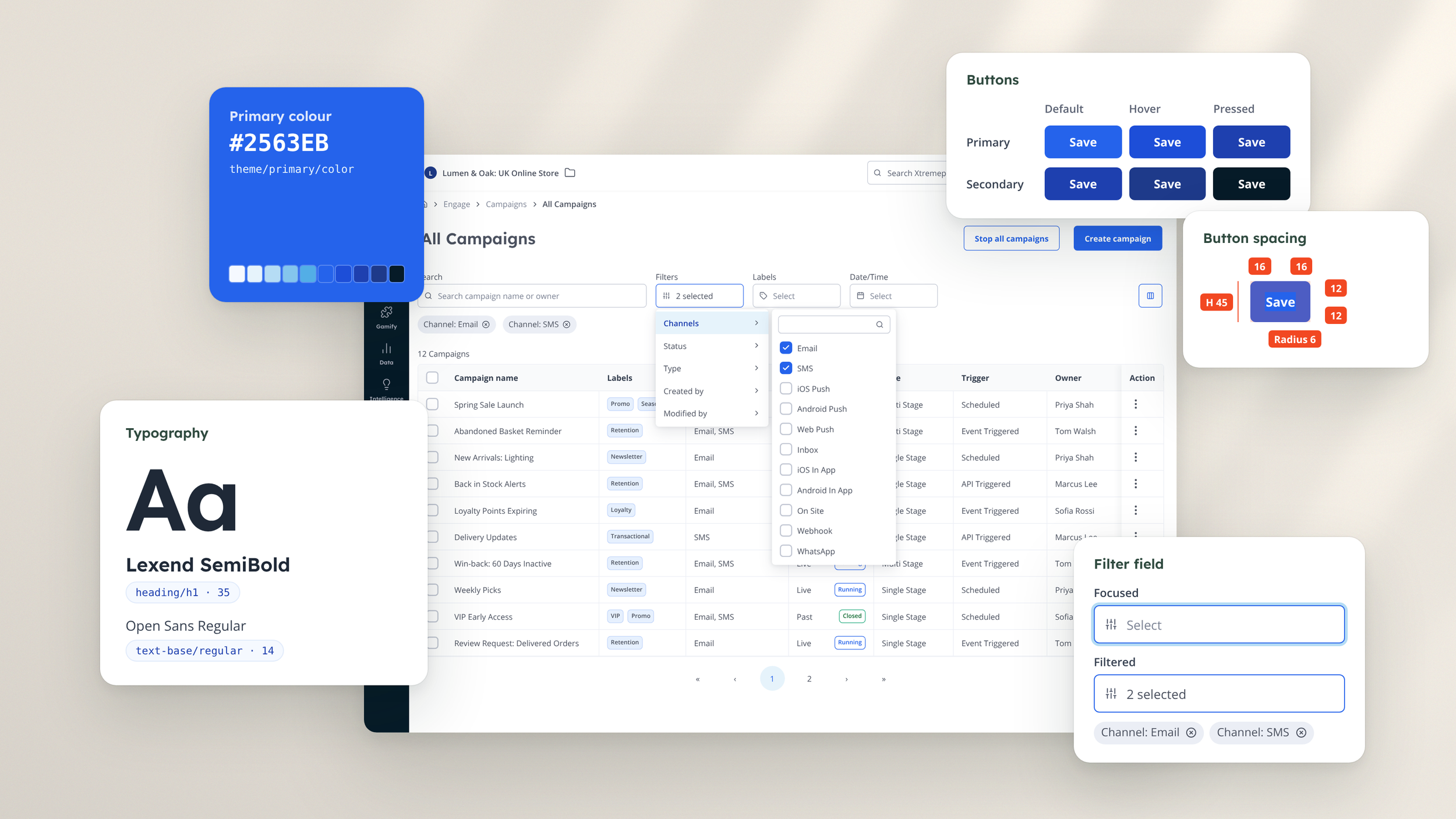
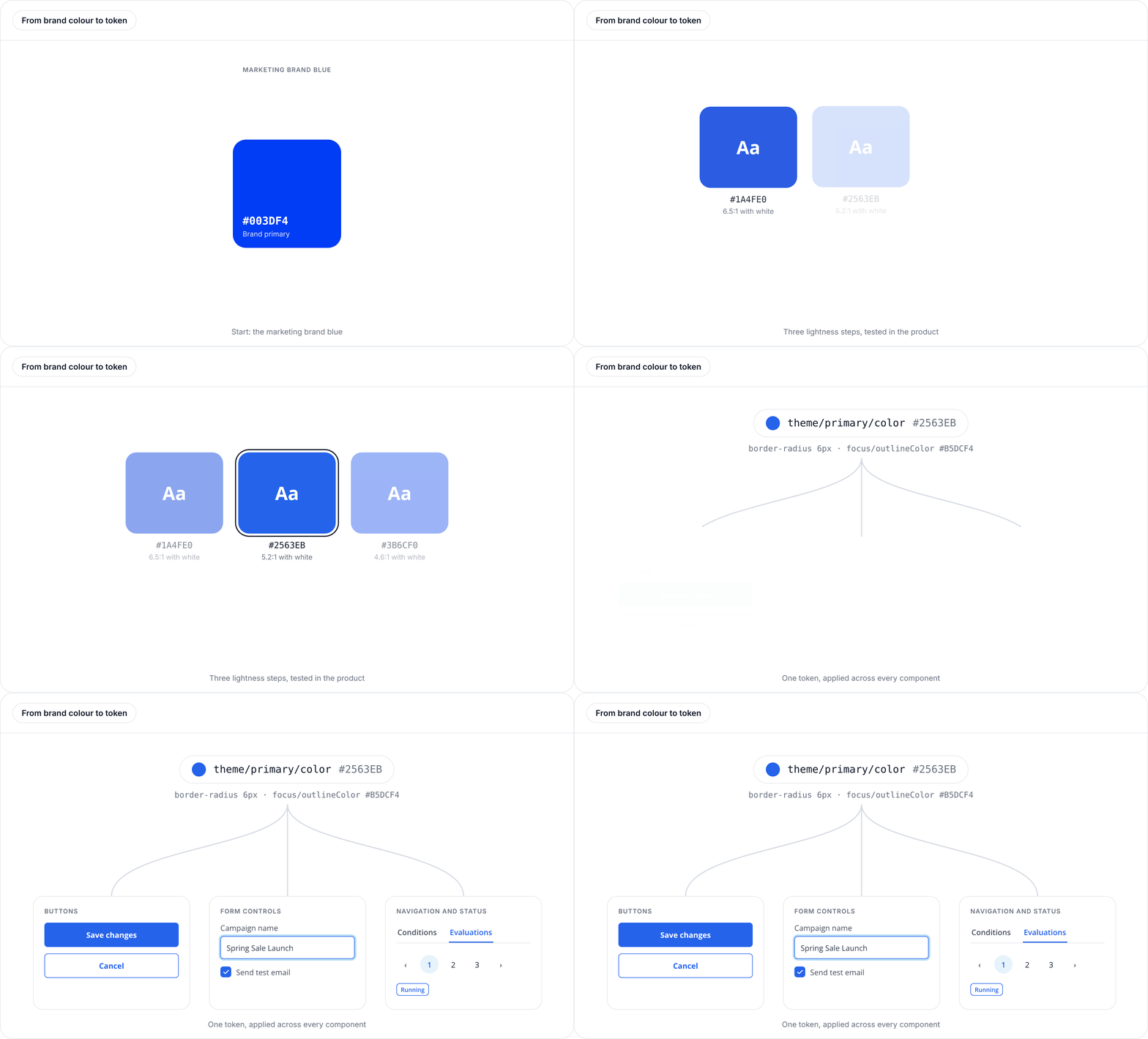
Colour. The marketing palette wasn't designed for a data-heavy interface. Its saturated blue competed with the content and failed WCAG AA contrast requirements. Rather than abandon the brand colour, I worked with a developer to explore tonal variations, testing them directly in the platform. We found that adjusting lightness, rather than simply desaturating the colour, preserved more of the original brand character.
We settled on #2563EB as the product's primary blue, with a tonal scale and semantic colours mapped to PrimeVue's tokens.
01
Typography. I established a consistent type scale using a 1.125 ratio, keeping headings compact for data-heavy screens.
02
Components. I adapted PrimeVue's tokens and defaults, then designed new components where the library didn't meet product needs, including navigation and modals.
03
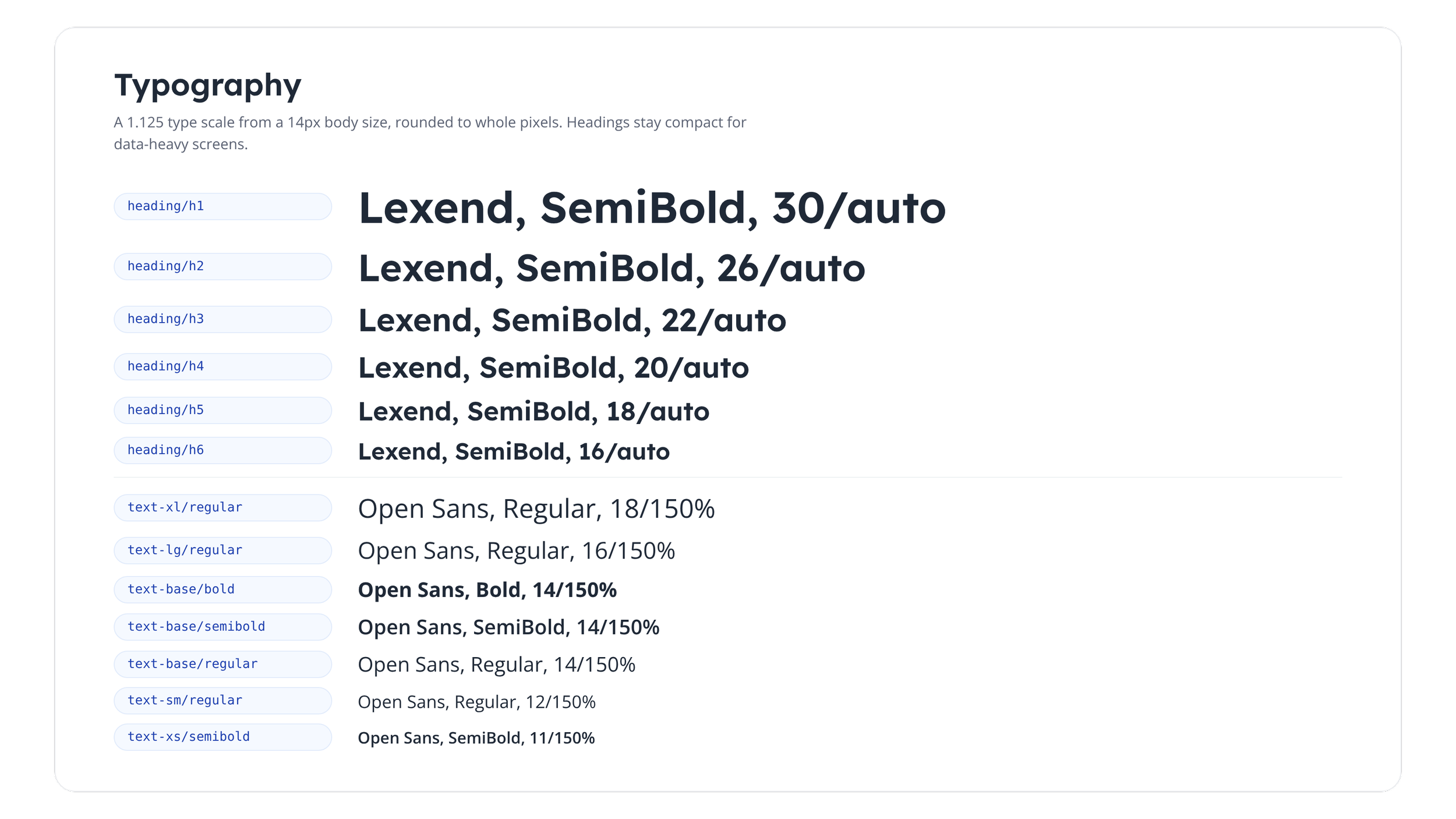
A 1.125 scale from a 14px text-base body size, rounded to whole pixels, with h1 and h2 adjusted for hierarchy at the largest sizes.
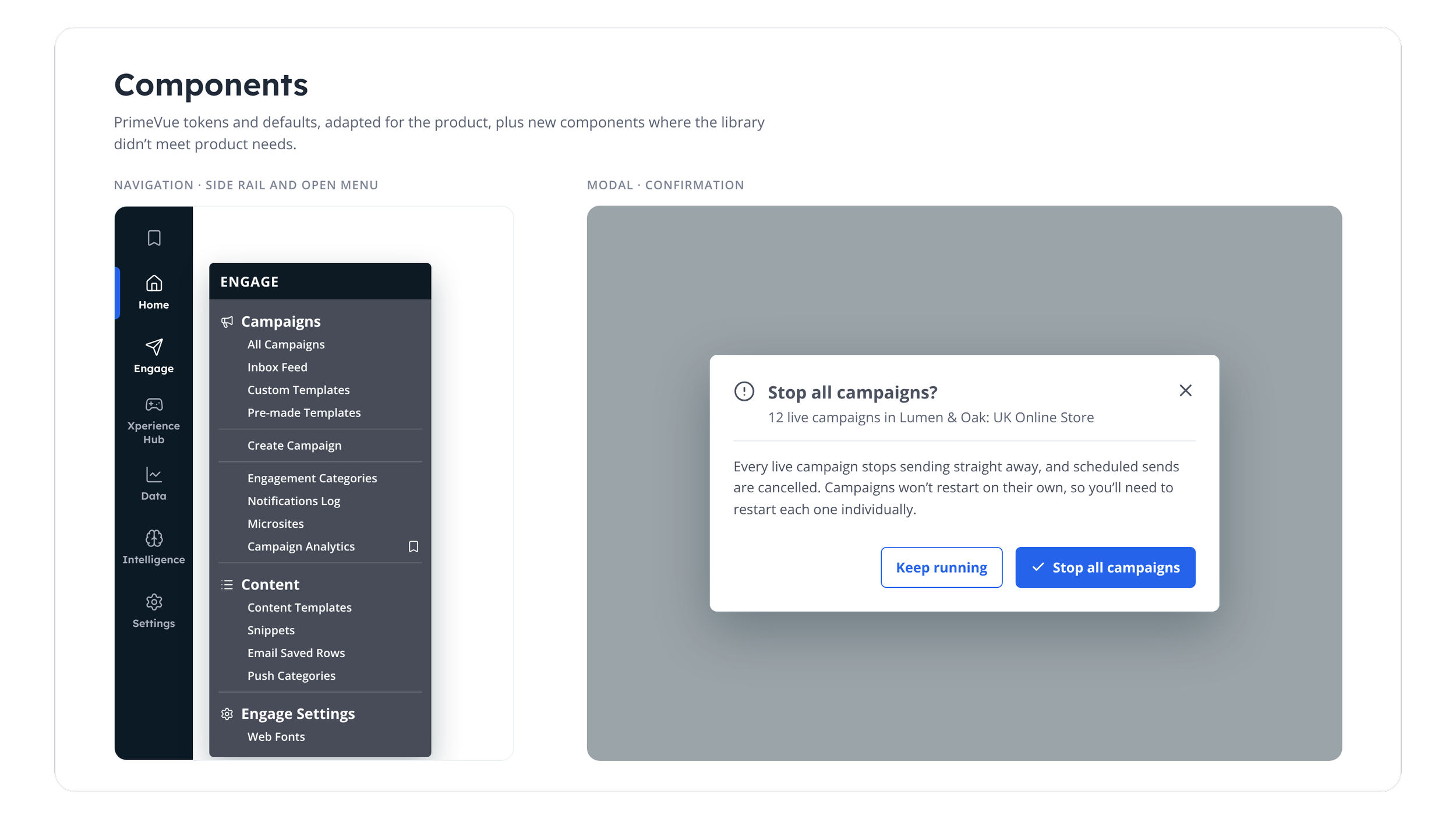
The system lives in Figma as reusable components, variables and properties, giving design and engineering a shared reference.
Auditing the existing product
02.
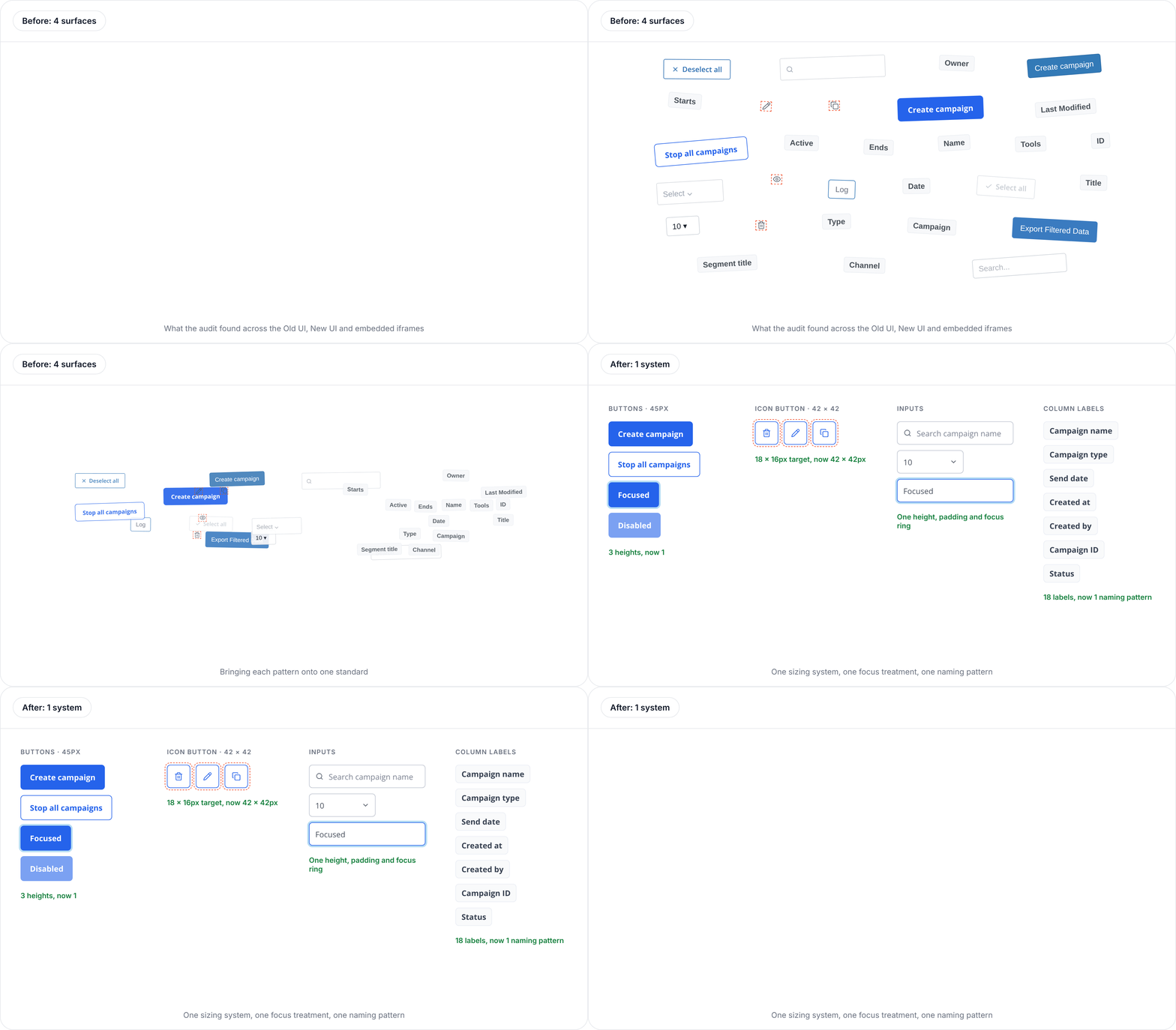
With the foundations established, I audited the existing interfaces to understand where the product fell short of the new standards.
The platform spanned four surfaces: the Old UI on Bootstrap 4, the New UI on PrimeVue, and two embedded iGaming and Loyalty iframes with their own hardcoded styles. I inspected interactive components across all four, recording colours, dimensions, typography, spacing and states. Claude Code helped me scale the audit across the codebase's style files, with every finding checked against the actual interface.
The audit exposed inconsistencies beyond appearance:
As well as:
Missing disabled states and suppressed keyboard focus indicators.
Inconsistent colours and component behaviour between surfaces.
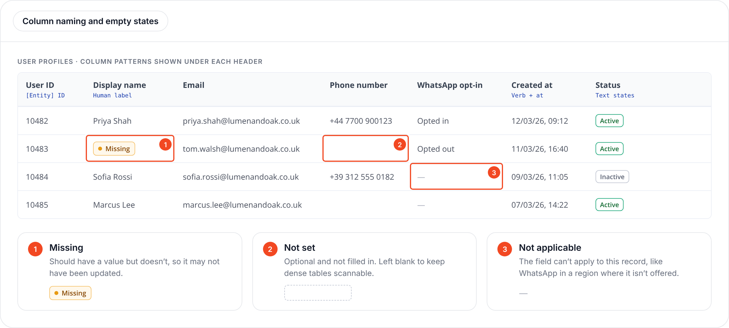
These findings helped prioritize the patterns that would have the greatest impact. Inconsistent button sizing became a shared sizing system, missing focus indicators became a defined keyboard focus treatment, and inconsistent data states became distinct patterns for missing, unset and not-applicable values.
I used the system to standardise the patterns customers and engineers interacted with most.
Buttons and interactive states
I established consistent sizing, action hierarchy, focus rings and explicit disabled states. The same rules could now be applied rather than recreated for individual screens.
Design defined
Component specifications and interaction behaviour
Design tokens and visual foundations
Contribution standards and design documentation
Navigation and page headers
I introduced shared breadcrumb and heading patterns, bringing embedded pages into line with the rebuilt UI without needing to rebuild their underlying code.
Tables and data patterns
I standardised column naming and introduced distinct empty states, so missing, unset and not-applicable values couldn't be confused.
As new pages were designed, I assessed whether existing components could meet the need or whether a new pattern was justified. Approved additions went back into the system for reuse.
The system also changed how engineering worked. Engineers now use the Figma library as a reference when building new features, reusing established components without needing me to design or review every screen. They also come back to design when something is missing or a new pattern needs to be considered.
For the system to scale beyond my own involvement, design and engineering needed clear responsibilities.
Engineering owned
Component implementation and code maintenance
Technical input into structural changes and component deprecation
Together
Changes affecting the structure of the system were considered collaboratively, balancing consistency with technical feasibility and maintainability.
Bringing consistency across the platform
03.
3
button heights: 34, 36 and 42px
18 × 16px
18
table column labels named inconsistently
Icon size: the smallest icon-only hit area
Outcomes
The system has moved beyond a design library into how the product is built and maintained:
Engineering self-serves: engineers use the system as their reference when building new features, without needing design to review every screen.
Less repeated design work: existing components can be reused rather than redesigned for each feature.One of our largest clients now makes every live journey change through a draft, without pausing the journey.
Reuse across the New UI: 91% of new features use existing components.
Adoption beyond the original platform: the Games back-office redesign is using the system.
A maintainable foundation: I handed the system to the incoming designer with a maintenance guide.
One designer can't review every screen.
The goal was to make consistency part of how the product is built, not something dependent on individual design reviews.