
Journey Builder: rebuilding a canvas teams can trust
ROLE
Senior Product Designer, sole designer
TIMELINE
Shipped - July 2026
Design in 2 weeks
TEAM
2 PMs, Head of Product, Head of Engineering, developers
SCOPE
Interaction design, UI design, UX writing, edge-case design and competitive research
Journey Builder 1.0 hid its steps behind unlabeled icons and told users their work was saved when it sometimes wasn't. I redesigned 2.0 to make every step, number and state easier to understand, then introduced live draft so teams could change a running journey without stopping it.
53% of projects with live journeys now run in 2.0, and editing a live journey went from a seven-hour pause to none.
IMPACT
53%+
Projects running live journeys in 2.0
231 of 434 projects with active journeys chose 2.0 while 1.0 was still available.
87%
Of active 2.0 journeys were built new
adoption appeared first in new work, as migrating large existing journeys takes longer.
7 hours → 0
Pause time to edit a live journey clients
teams can now test changes in a draft while customers continue through the live version.
The starting point: a builder users couldn't easily read or trust
Journey Builder lets CRM teams automate multi-step campaigns across email, SMS and push. Version 2.0 was a rebuild focused on performance and new channels. Product prioritized the Journey Builder rebuild because it couldn’t scale: it processed users one at a time instead of in batches, so the team chose to rewrite the backend and used that rewrite to add the features clients had been asking for.
I had a tight deadline and no direct client access, so I used support tickets, Jira issues and a review of competing platforms, including Braze, Iterable, Salesforce, HubSpot and Adobe.
01
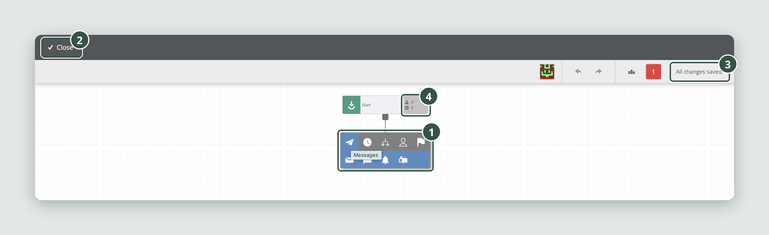
Four issues stood out in 1.0:
Unlabelled steps: users had to recognise an icon and hover to find its name.
02
Little context: the header had no journey name and offered only a Close action.
03
Unreliable save feedback: a support ticket described “All changes saved” appearing even when changes had been lost.
04
Unlabelled metrics: nodes displayed small icons and numbers without explaining what they meant.
Exploring a better canvas
I wanted to make steps easier to find and identify, while leaving enough room for the complex journeys teams needed to build.
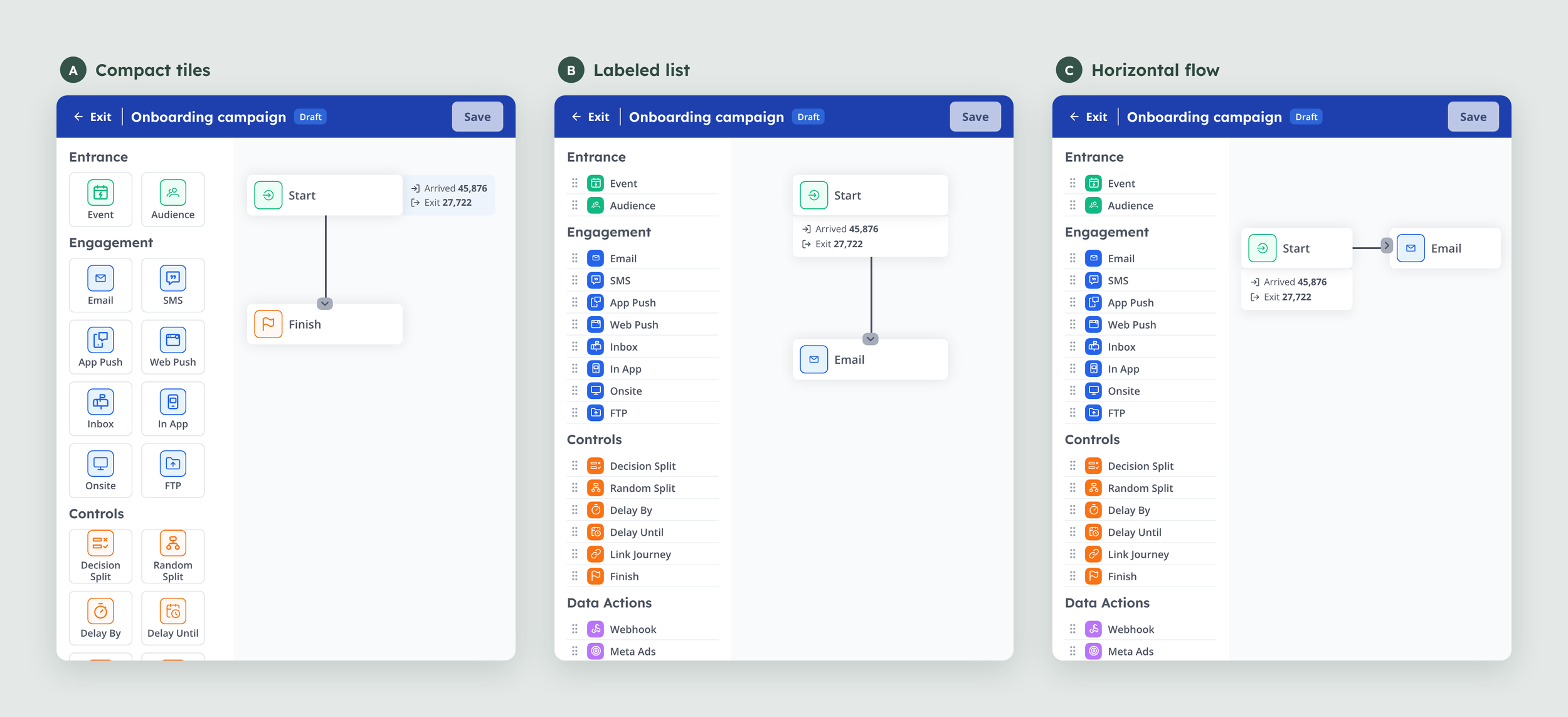
For the canvas, I reviewed large client journeys with complex branching alongside Product and Engineering. The vertical layout remained easier to follow and familiar to users. The problem was the workspace, not the direction of the flow, so I focused on improving the sidebar and controls around it.
I explored a compact tile sidebar, a text-heavy list and a horizontal flow. The list made each step identifiable but created a denser menu. Tiles offered a better balance between visibility and space.
Making the journey easier to scan
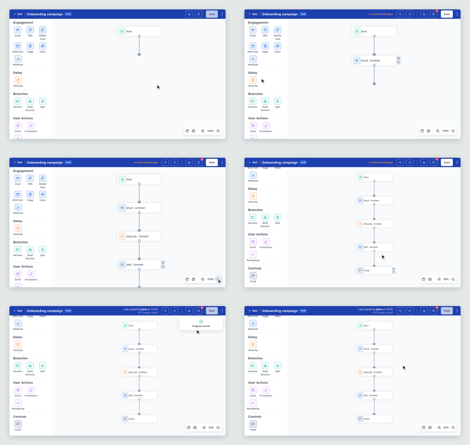
In 1.0, users had to recognise an icon and hover over it to discover its name. The new tile sidebar shows each step with a visible label, more spacing and grouping by category, making actions easier to identify at a glance.
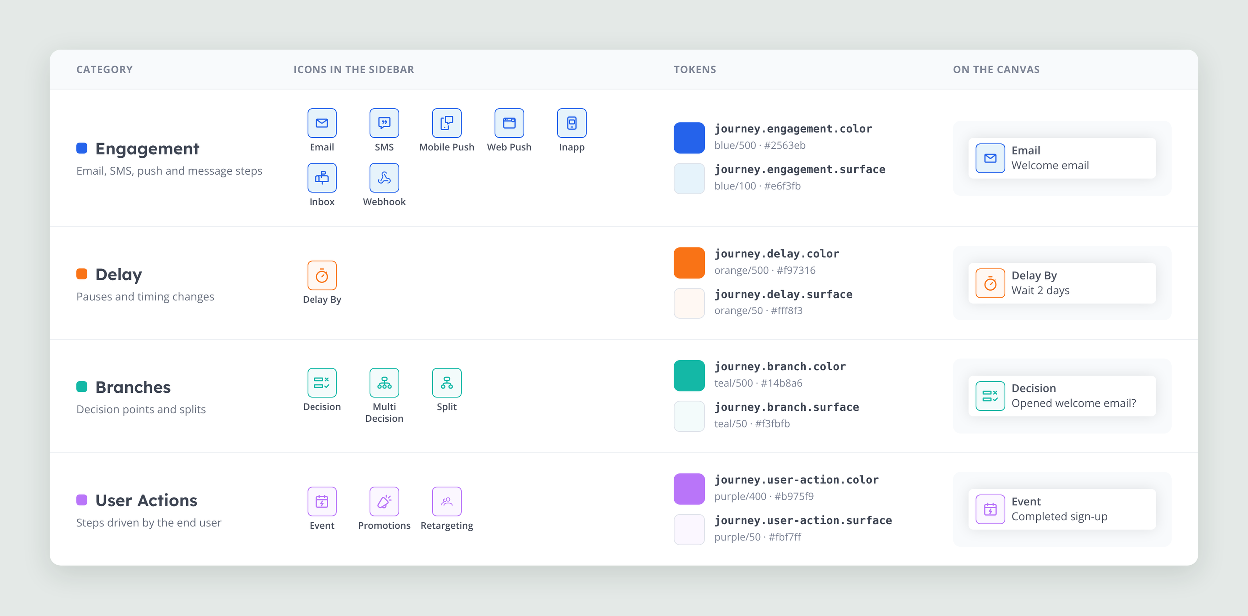
I introduced a colour system to give each category a consistent visual identity, helping users recognise different types of actions without having to read every label:
Blue for Engagement: I kept the primary brand colour for email, SMS and push actions, carrying brand recognition into the builder.
Orange for Delay: I chose a contrasting colour to make pauses and changes in journey progression stand out from standard engagement actions.
Green for Decisions: Green sits harmoniously alongside the brand blue while remaining visually distinct, making decision points and branching logic easier to identify.
Pink for User Actions: A separate colour distinguishes actions taken by the end user from actions configured by the campaign, helping clarify who or what is driving each step.
The colours carry through from the sidebar to the canvas, creating a consistent visual language as users build and read a journey. They work alongside labels and icons rather than replacing them, so categories remain identifiable without relying on colour alone.
Together, visible labels, spacing, colour and clearer node information reduce reliance on memory and make complex journeys easier to navigate.
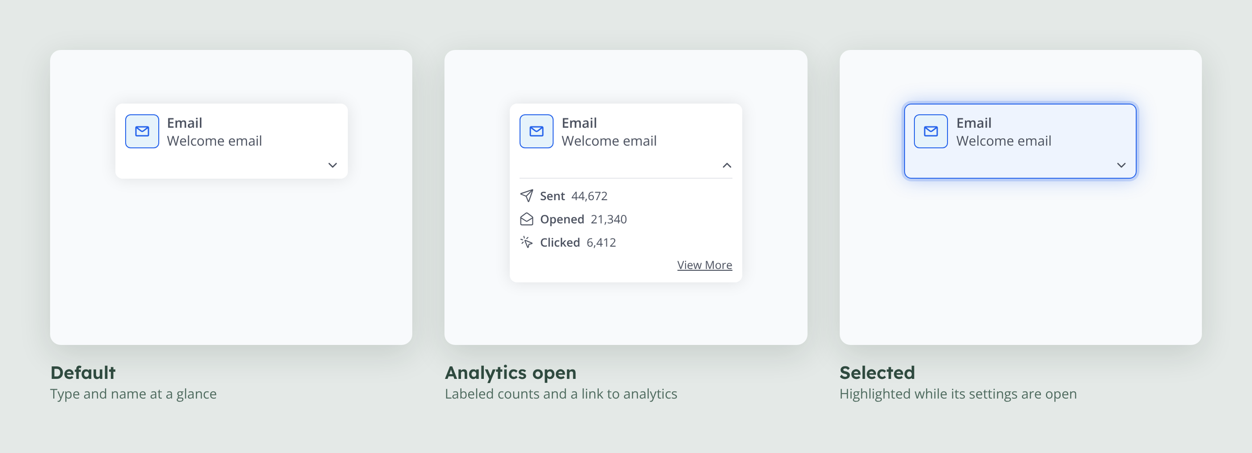
Each node also shows its type, name and labelled Arrived and Exit counts, with a link through to analytics. Subtle backgrounds and shadows distinguish nodes from the canvas and make selected states easier to recognise.
What shipping taught me
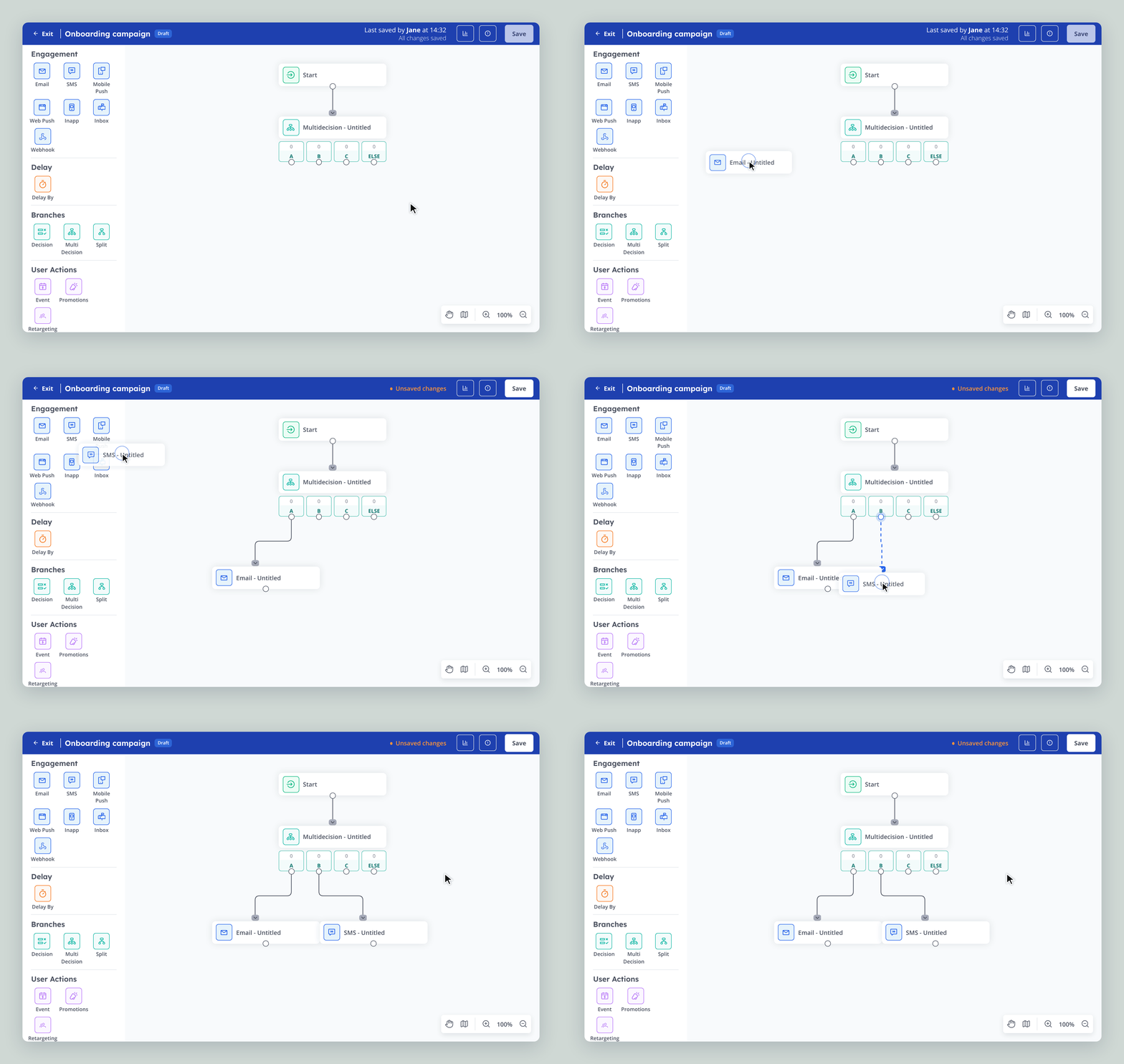
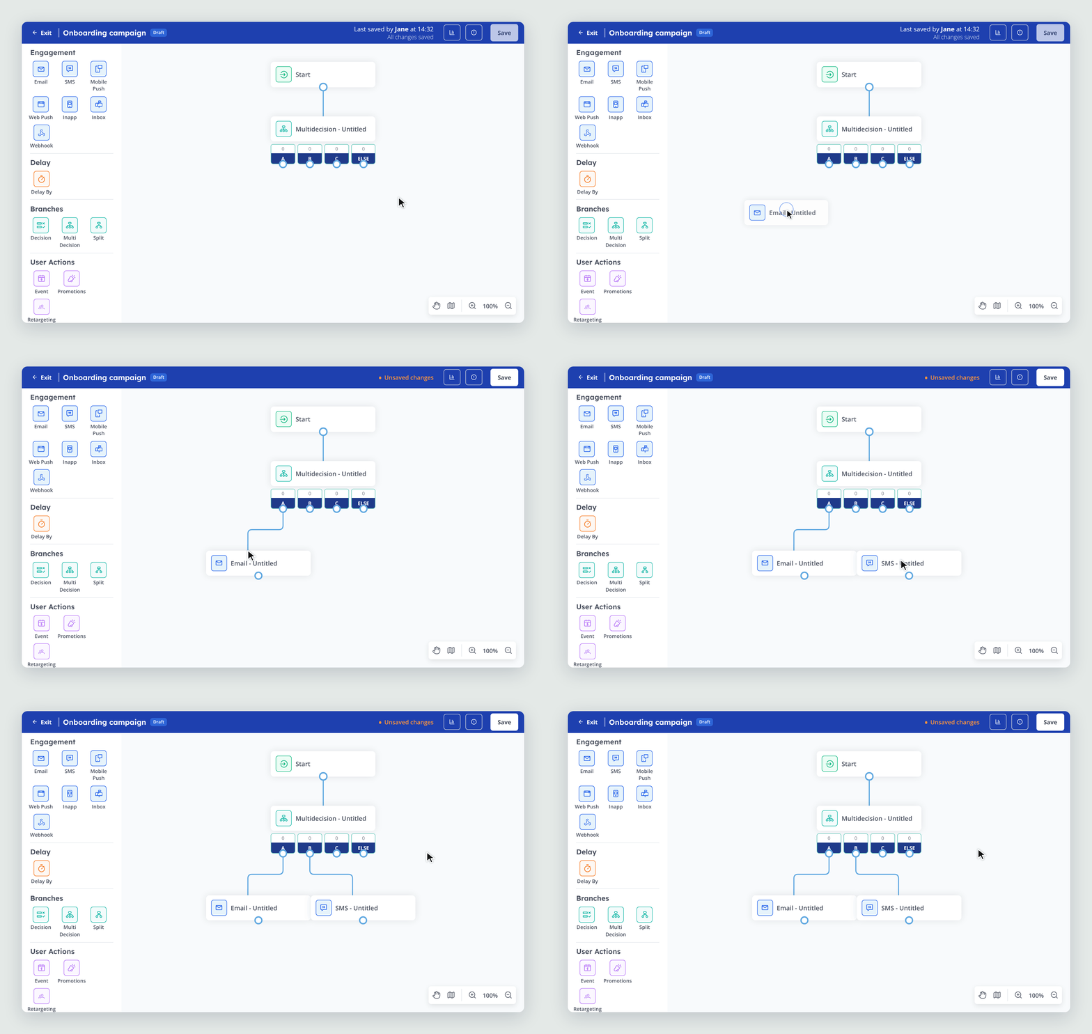
After launch, a user dragged a step towards a highlighted area around a node, expecting it to connect. The highlight actually indicated how far the node would expand, but its appearance suggested a drop zone.
I'd proposed auto-connecting steps during the build, but it was descoped for time and complexity. The support ticket showed that users expected the interaction. Auto-connect is now in the backlog, and I'd also change the highlight so it doesn't promise an action the interface can't perform.
Making live edits safe
A more serious issue emerged from 2.0's autosave behaviour. Every change saved instantly, meaning unreviewed edits could reach customers. Teams editing live journeys had to pause them for QA with one client reporting this took seven hours, or duplicate the journey to test changes safely.
I reviewed how competing platforms handled draft and publish states and proposed a hybrid model to the PM and Head of Product. The first release was scoped to one shared draft per journey with an explicit save.
Separating what's running from what's being edited
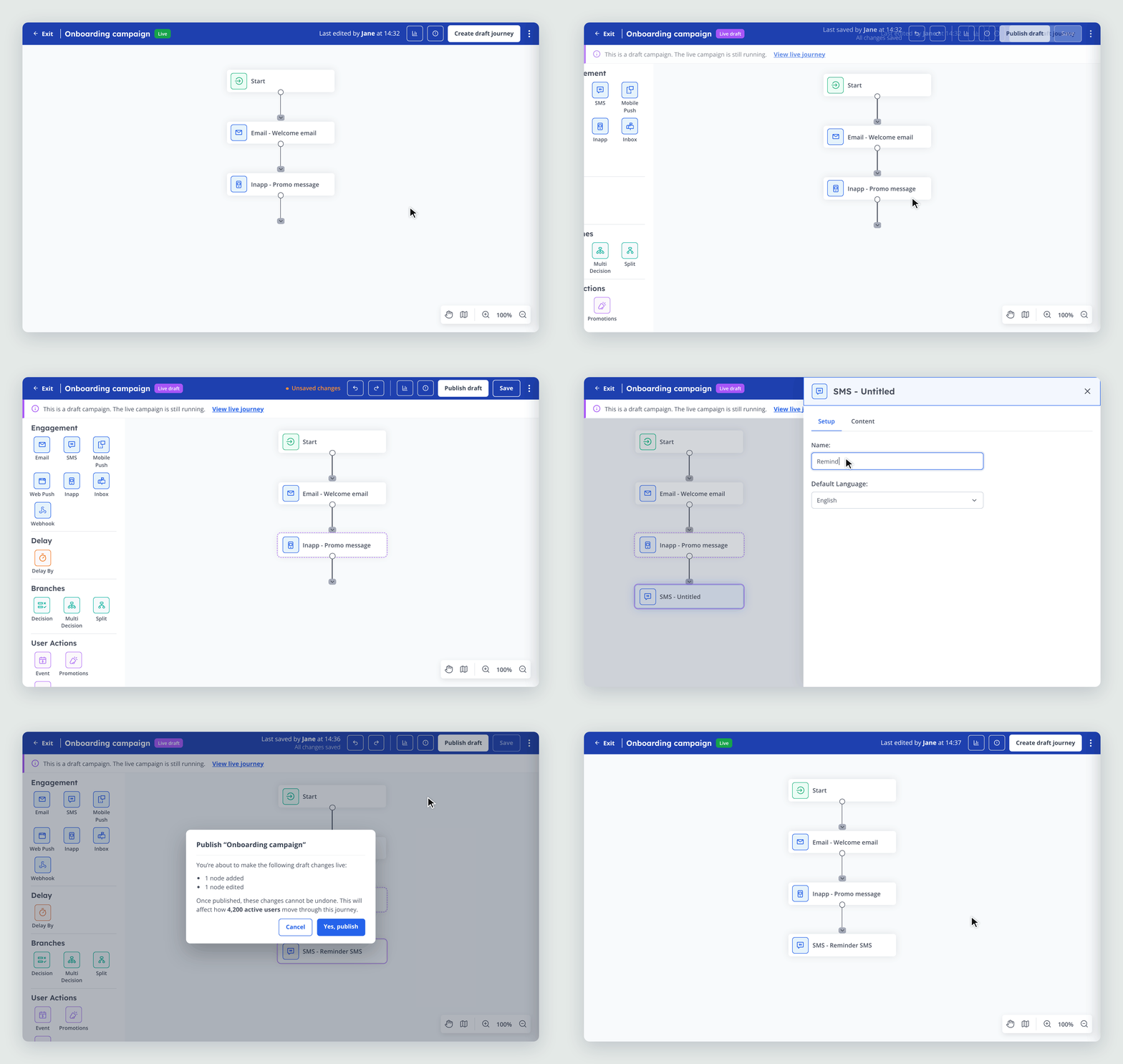
I made the difference between live and draft structural. The live journey opens read-only, while edits happen in a separate draft space. A clear banner tells users: “This is a draft campaign. The live campaign is still running.”
Teams can test changes without interrupting the version customers are moving through.
I chose purple for the draft state because it contrasts strongly with the blue header and stands apart from the green Live status, so teams can tell at a glance which version they’re working in. Colour is never the only cue: a “Live draft” label, dashed outlines for edited steps and purple outlines for new steps carry the same meaning. The colour treatment meets WCAG AA contrast requirements.
Designing the full saving and publishing flow
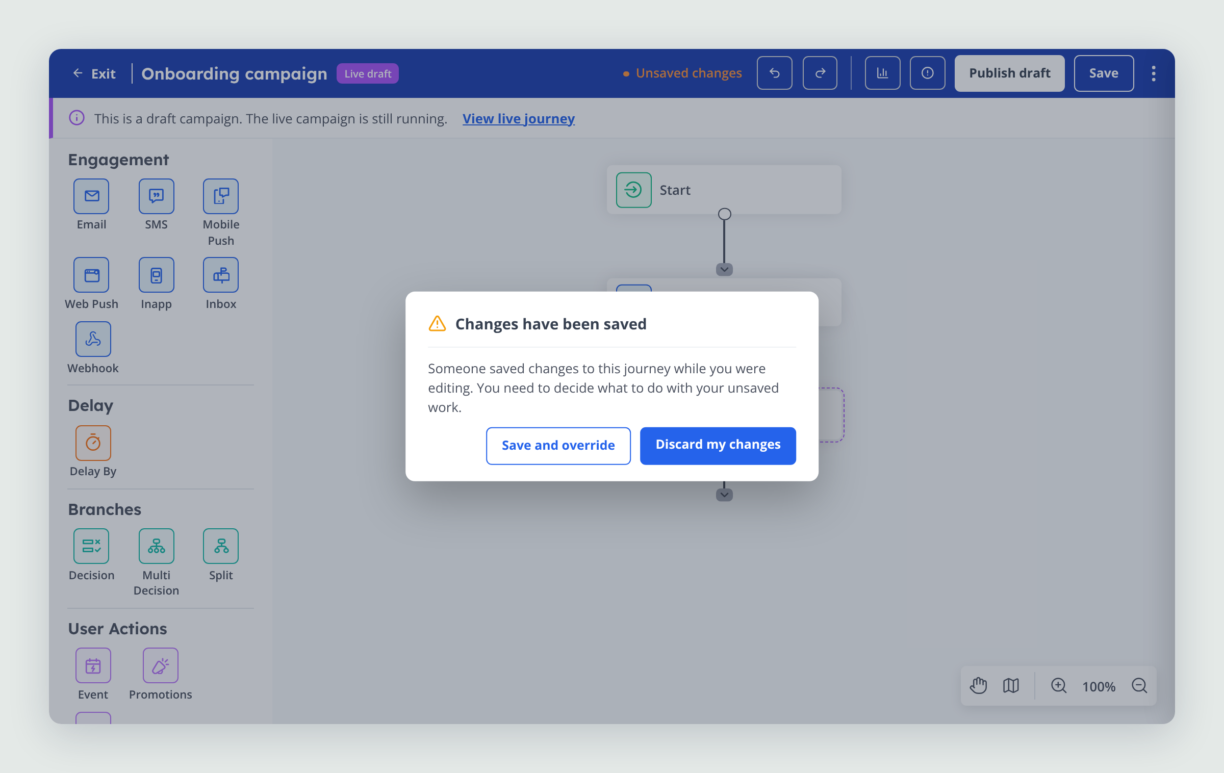
When the PM shared draft copy for a conflict dialog, I asked to map the full saving and publishing flow before writing the words. The dialog couldn't be accurate unless we understood what happened in every scenario.
That review exposed a gap: if a colleague published while someone else was editing, the editor closed and unsaved work could be lost without warning.
I designed the flow around one principle: no one should lose work without choosing to. Editors are warned before they start, notified when someone else saves, and given the option to save and override or discard their changes. Before publishing, a review shows what will change and how many active users will be affected.
Results
The redesign has delivered measurable adoption and a safer way to make changes:
231 of 434 projects with active journeys chose 2.0 while 1.0 remained available.
87% of active 2.0 journeys were built new in 2.0.
One of our largest clients now makes every live journey change through a draft, without pausing the journey.
At the first live draft demo, the client's only change request was a button label.
What I’d do next
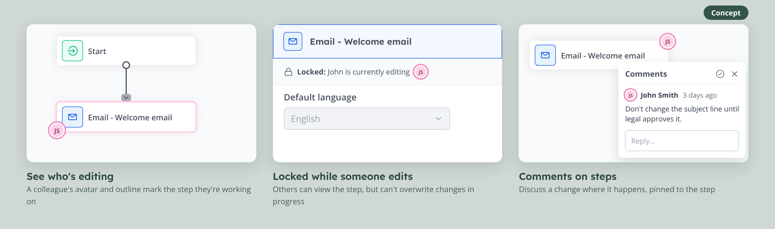
Auto-connect on drop and a clearer drag-and-drop highlight are the next improvements. I've also prototyped collaborator presence and comments pinned to nodes to explore how teams could work together on complex journeys. I'd validate those ideas with a client team before building them.