
Sustain
End to end iOS app
Background
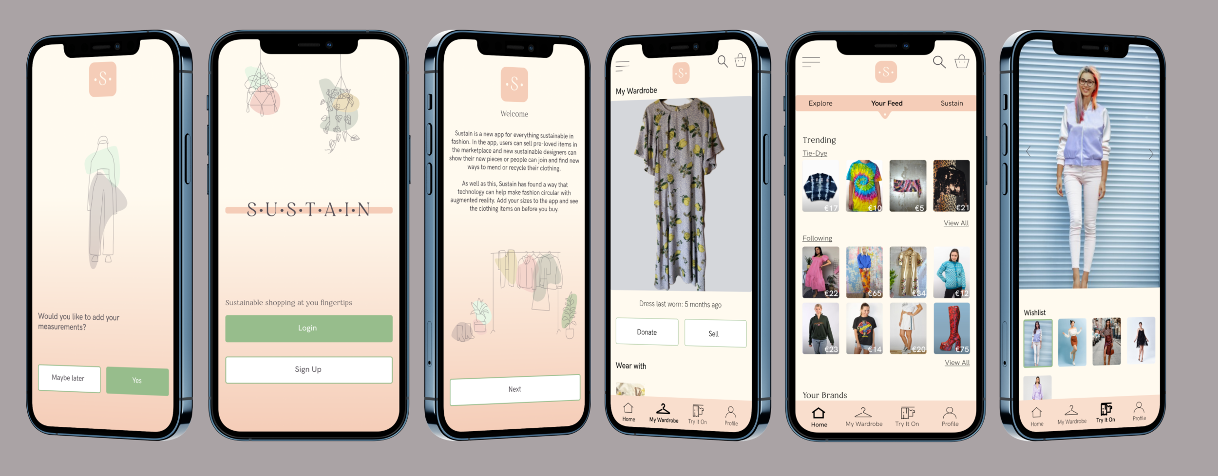
Sustain is a new app for everything sustainable in fashion. The future of fashion is circular but HOW do we move from a linear “make-take-dispose” model to a one thats less wasteful. Well, Sustain is here to help.
Note: Sustain is a fictional brand created by me as a project for DesignLab
Objective
In the app, users can sell pre-loved items in the marketplace and new sustainable designers can show their new pieces or people can join and find new ways to mend or recycle their clothing.
As well as this, Sustain has found a way that technology can help make fashion circular with augmented reality. Add your sizes to the app and see the clothing items on before you buy.
Role
UX/UI Designer
UX Researcher
Duration
4 weeks
Phase 1: Discovery
Research
Primary research was conducted through 1:1 interviews and surveys to gain insights into people sustainable shopping habits
Secondary research to gain insights into Sustains competitors through competitor analysis and market research if sustainable shopping practices
This is done to validate assumptions of people’s needs from a sustainable shopping app
Market Research
Through market research I wanted to gain a better understanding of the sustainable issues within the fashion world and discover how Sustain and other brands can help prevent these issues.
Some insights I found were:
A 2018 report from returns technology provider Optoro estimated that eCommerce returns contributed 6.5 billion USD of landfilled waste in the U.S. alone, and an additional 15 million tons of carbon emitted into the atmosphere.
While the sales uplift is good on paper, returns are a killer for any eCommerce business.
ASOS, originally one of the pioneers in the returns space, only recently announced changes to their returns policies to include blacklisting “serial returners” due to the financial impact of this learned behaviour.
According to Wrap ‘the value of unused clothing in wardrobes has been estimated at around £30 billion. It is also estimated £140 million worth of clothing goes into landfill each year’
Ultimately, there are too many clothes in the world, but the question is what can we do with unused clothes?
Competitor Analysis
While looking for Sustain’s main competitors, I wasn’t only looking at buy and sell apps but also apps that were trying to make a sustainable impact with their brand and the way their apps work. Here I found 3 main competitors that are sustainably driven, I also found 1 in-direct competitor, Farfetch. Although they are not a buy and sell app they have developed a fashion footprint tool which educated people in the material they buy and the effect it has on the planet.

Surveys
Here I created an online survey with Google forms. I asked 16 questions about sustainable shopping habits to gain insights about how much people understand or know about shopping sustainably. I had 38 responses.
Some insights were:
65% of the participants prefer to shop online (42% app, 23% desktop)
69% of the participants don't know any retailers that have a recycle or sustainable return initiative but 73% said it would influence their decision to buy if the retailer had one.
42% said it would affect their choice to return an item if they knew it was bad for the environment to return the item, but also 42% it might affect their choice leading me to believe that most people don't know the process of returning items.
1:1 Interviews
I interviewed 4 female participants in person aged between 27 and 32. I asked questions about where they like to shop and asked questions to better understand what people know about the impact of returning clothing and if people are interested about shopping sustainably.
Some insights were:
Sizing recommendations on clothing sites are around but are still very new to people. The participants mostly seem interested and would try it but don't know or understand how the process would work
Everyone only returns items because of sizing and returns items nearly with every purchase
Nobody thinks about where the items go once returned and assumes they go back to be resold, giving a big opportunity to get people more informed and give them other alternatives

“I’ve recently started thinking about sustainability when shopping but to be honest, I don’t know where to start.”
-Amy, 32. Tries not to return items

“Now I only shop online. I wouldn’t buy from a store if they didn’t have an app.”
-Denice, 30. Returns items nearly once a week

“I only ever return items because the size isn’t right”
-Nicola, 27. Returns items 1 in 10 times
Feature Opportunities
After analysing all the research I came up with priority 1 feature opportunities that would make Sustain a great app for users and the environment.
Newsfeed
News/articles about sustainability while shopping (returning items/how to know if a brand is sustainable)
Recommendations on instagrams to follow or podcasts to listen to if you know to know more
Posts from charity shops about what they have in store/ information on what the charity shop does
Tips on the best way to use a buy and sell app, how to sell/buy items
Information about sustainable brands
Small businesses in the area
VR
Add measurements and give recommendations of clothing to buy
Scan clothes you want to sell to get exact sizing of clothes
A virtual reality of the clothing on a vr of your body type
• A feature to take pictures of clothing in your wardrobe and get notifications of items not worn in a while. You then get the option to sell, donate or recycle/up-cycle that item.
Phase 2: Define
In the define phase I define the main user of Sustain by creating a user Persona, a User flow and a site map.
Persona
Meet Sinead. Through my research of interviews and surveys I began to see similarities in the answers of the participants. From this, I was able to create a persona with common goals, frustrations and behaviours of who would be the main Sustain demographic.

Site Map
A sitemap is created to outline the information architecture of the app.

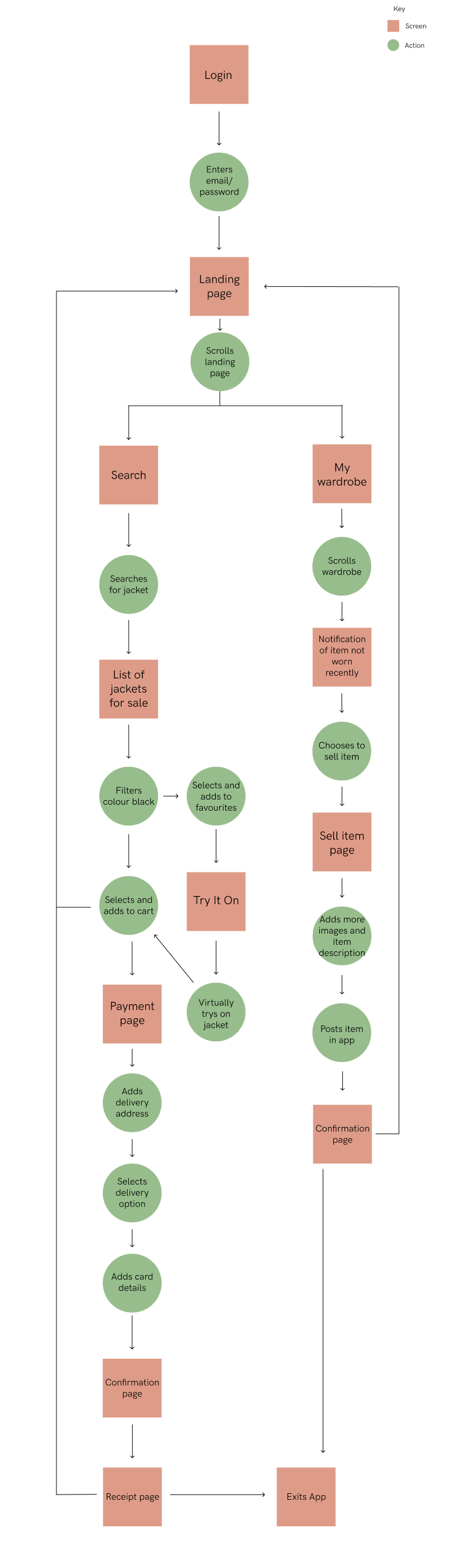
Userflow
This user flow shows two ways a user might flow through the app.
Branding
As Sustain was my own creation I had full control of the branding. I wanted to keep the app light with earthy tones and keep the font clear and simple. With this in mind I began developing some logo ideas. Keeping it simple I used just text and 1 colour and I researched fonts that resonated with sustainable aesthetics.
From here I created the brand tile with the font and final logo I will be using for the app.
Phase 3: Design
Sketches
Before designing low-fidelity wireframes I sketched out some ideas of the layout, to get a better idea in my head of how the app will look.
Low-fidelity wireframes
These wireframes were created in Figma, keeping this user flow and information architecture from my research in mind.

High-Fidelity frames
After getting the branding and colour palette exactly right and with some iterations of the low-fi and high-fi wireframes it was time to bring the app to life and create the final mockup designs.

UI Kit
A UI Kit is then created containing all the design elements of the app. These are used for consistency when building the app and as a guideline when creating new pages. This kit demonstrates the simple, earthy feel of the app that I wanted.

Phase 4 : Prototyping and testing
Prototype
With my final high-fidelity frames, I created a prototype in Figma.
Usability Testing
Usability testing was done in person with the prototype and online through unmoderated remote testing with Maze. Participants were asked to complete 3 tasks.
Sign up and set up your measurements
You want to sell an item, where would you go?
Go to ‘your wardrobe’
And then asked 3 questions.
How did you find the sign up process?
Was it easy to find where to sell an item? would you suggest another way?
What did you think of the app and the overall design?
Participants
2 participants in person and 1 online over zoom
1 male. 2 female
4 participants through unmoderated testing with Maze
Objectives
Observe how users flow through the app
Determine how easily users can complete a task
Observe any frustrations users may have while using the site
Results
With in person testing, everyone completed each task in under 2-3 minutes
Through the unmoderated testing with Maze:
Task 1 had 25% completion rate with the expected path and 50% with unexpected paths
Task 2 had 25% completion rate with expected path and 75% with unexpected paths
Task 3 had 100% completion rate
The biggest issue participants had with the test was finding out where to sell an item. When designing the app I didn’t want the app to just be about buying and selling so I didn’t make that the main focus.
Comments from participants
Sign up process
"I thought the form required a lot of information. An email and password seems to be standard these days for signing up in an app? There was a lot of text that I didn't read entirely because I wanted to move through the signup process as quickly as possible and start trying on clothes! :)"
“Easy to follow, simple”
Selling an item
"It was not super easy. First I looked for a button or icon on the main screen, and didn't find anything. Then I went to the hamburger navigation at the top left, and still didn't see anything that specifically said "sell". Then I randomly decided to check my profile and found the button. I would love to see it as an icon on the main screen, if this is an important feature of the app!"
“It was not super obvious, maybe should be a separate button”
Overall impressions
'“I like the color theme which sets a tone of chic feeling. The interface is clear."
“I like that it’s similar to other social media so its familiar to use”
Design Improvements
From feedback I will make the selling option clearer. Almost everyone went to the hamburger icon looking for the sell option but nobody checked that it was in profile, therefore I will create ‘sell’ as its own section in the hamburger icon.
I will also add an option to sell in the homepage to make it easier for users to find. I will add an icon in the main bottom navigation.
Conclusion
Next steps
I would conduct another round usability testing after I have implemented the design updates from this round and continue testing after this. It is important to keep iterating on your designs and listen to what the users want.
As this project has a time limit, I wanted to get the main pages finished to get the look and idea of the app. There are still a lot more pages in the app to be designed to make it a complete app and more ways to make it a sustainable fashion app, as that was my main goal for this project.
Some more ideas for the app are:
A review section where people can review clothes they have bought on brands or the high street
A notification when someone on the app has donated clothes to a charity shop
A initiative if you sell on the site instead of returning to a store (if it's not sustainable) you get credits but buy something else on the site
Links to charity shops and recycle banks in your area
What I learned
This was the biggest project I’ve worked on so far. Creating an end to end app has been a great way to fully understand and design for a full user journey. My main goal for this project was to create a space where fashion can be sustainable for everyone. Whether a person is a eco warrior or someone who wants to gain a bit more understanding about the economic issues within the fashion world and doesn’t know where to start, all the while making it an easy process for the user to do this.
Some challenges I faced creating this app was the augmented reality side of the app. As AR isn’t that mainstream yet, it was hard to get people to understand the concept or believe it would work. My goal was to design an AR interface that made it easy for the user to understand the process of how it works and have it become natural for them to use.
I wanted users to be able to virtually try on items, from my research everyone returned items because of sizing. With projections showing that global e-retail sales are going to grow to up to $4.8 trillion by 2021, there needs to be a way customers can try items online. This is just one way to try and help the unnecessary return and waste of clothing.
Explore more projects

Flyover bed & breakfast
Responsive website for a small business

Spotify
Adding a new social feature to Spotify